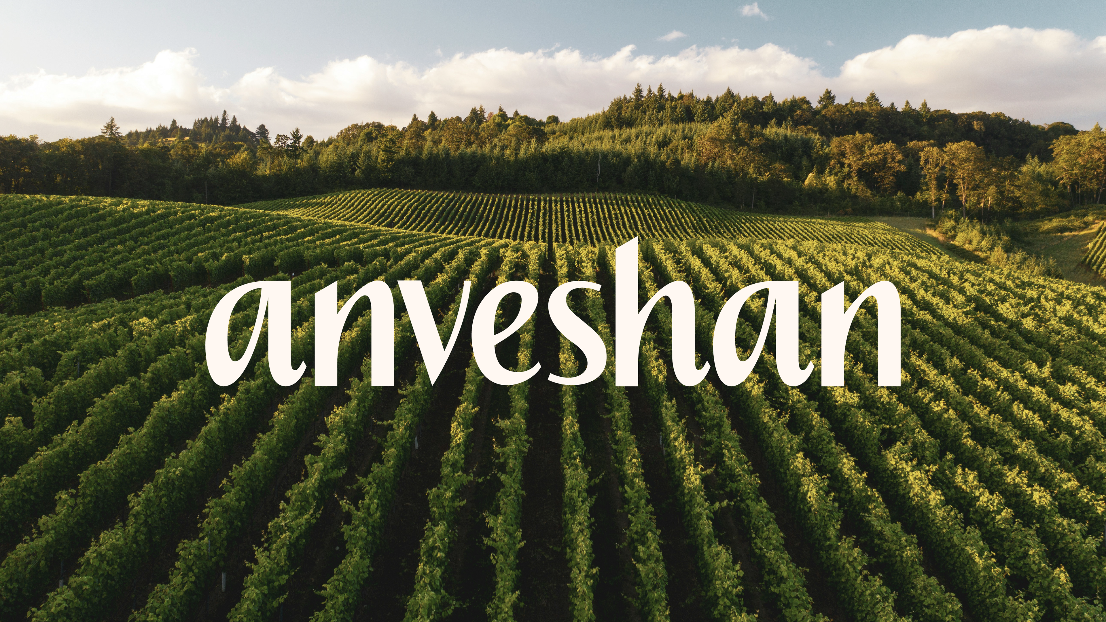
Anveshan, a brand rooted in the organic and natural food industry, offers traditionally made, natural products like cold-pressed oils, A2 ghee, raw honey, and stone-ground spices. The biggest challenge for Anveshan was inconsistency across products and a weak brand identity hampering credibility.
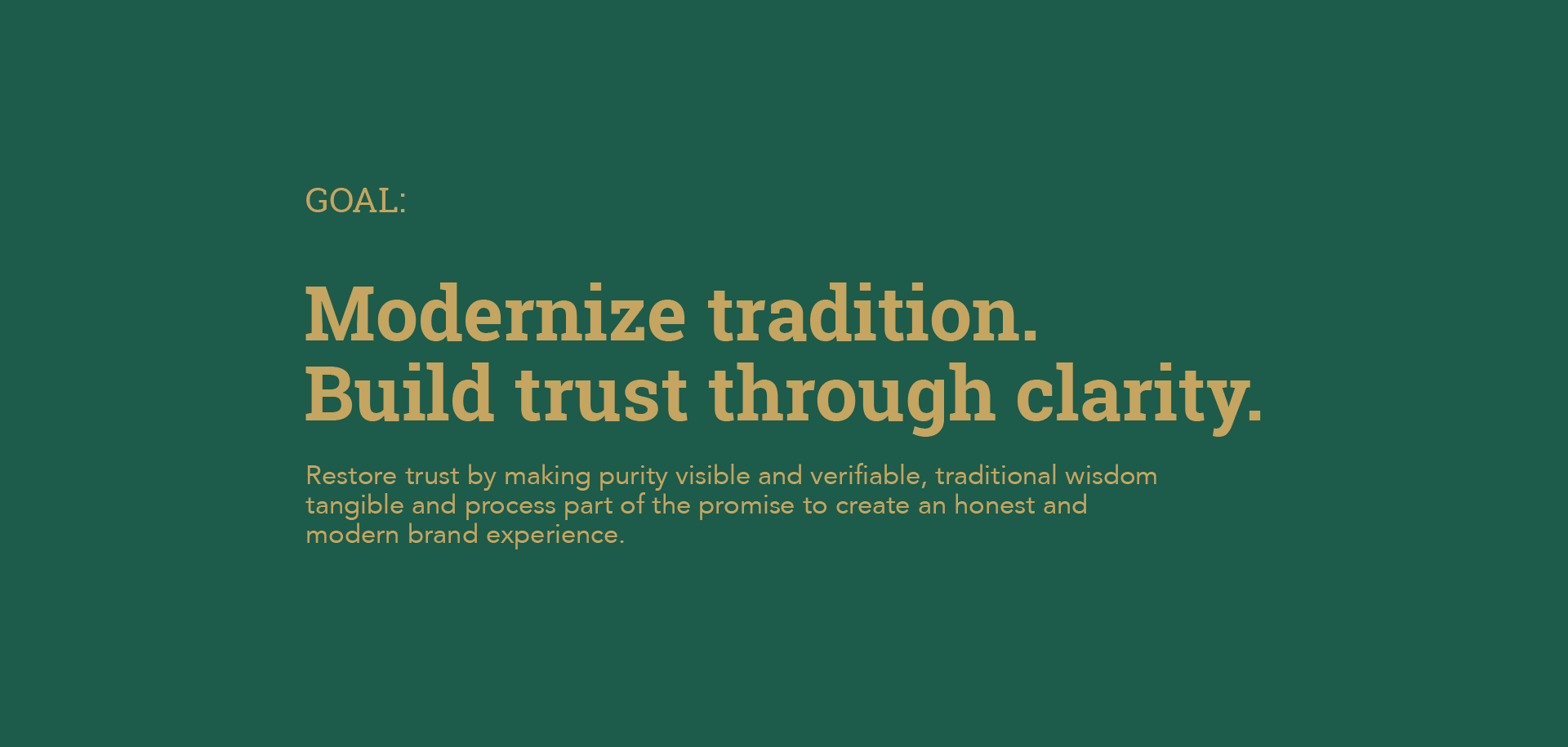
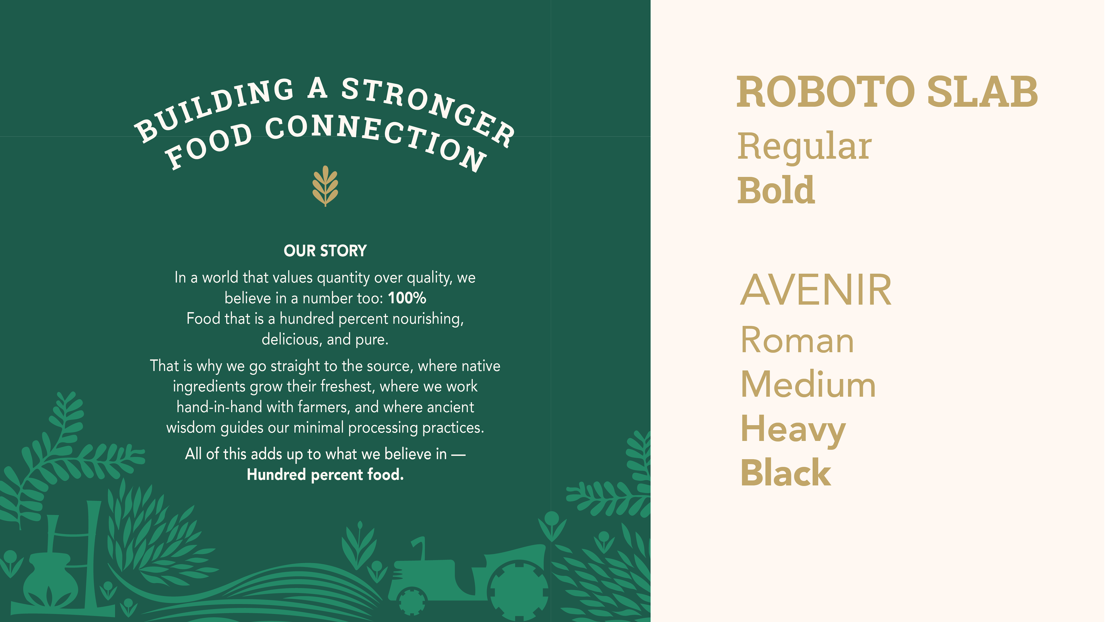
This rebrand refined Anveshan’s story to modernize tradition and build trust through clarity, creating a more consistent and authentic brand identity. Through strategic design choices, the brand’s visual narrative was strengthened to make purity visible and traditional wisdom tangible. Additionally, I developed an extendable design system that transforms packaging into a clear and powerful storytelling medium, reinforcing the brand’s core values at every touchpoint.
Video Animation to convey the brand illustration and logo creation.
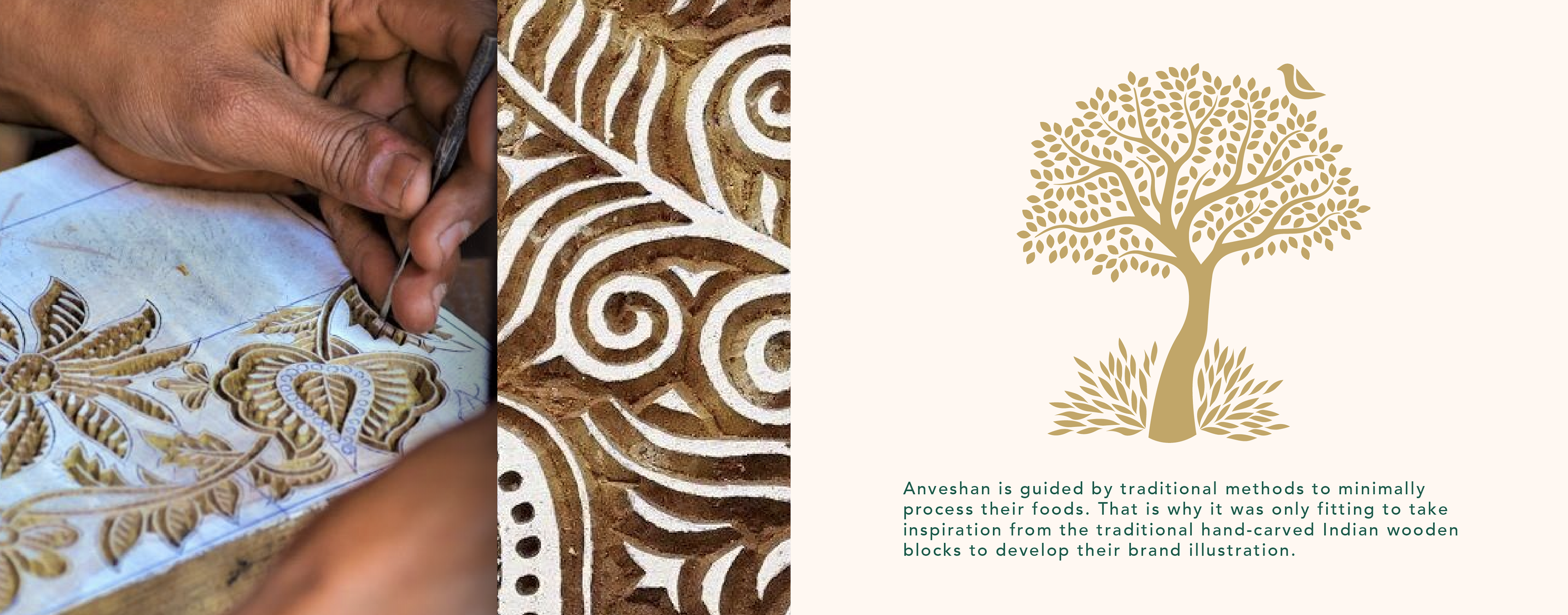
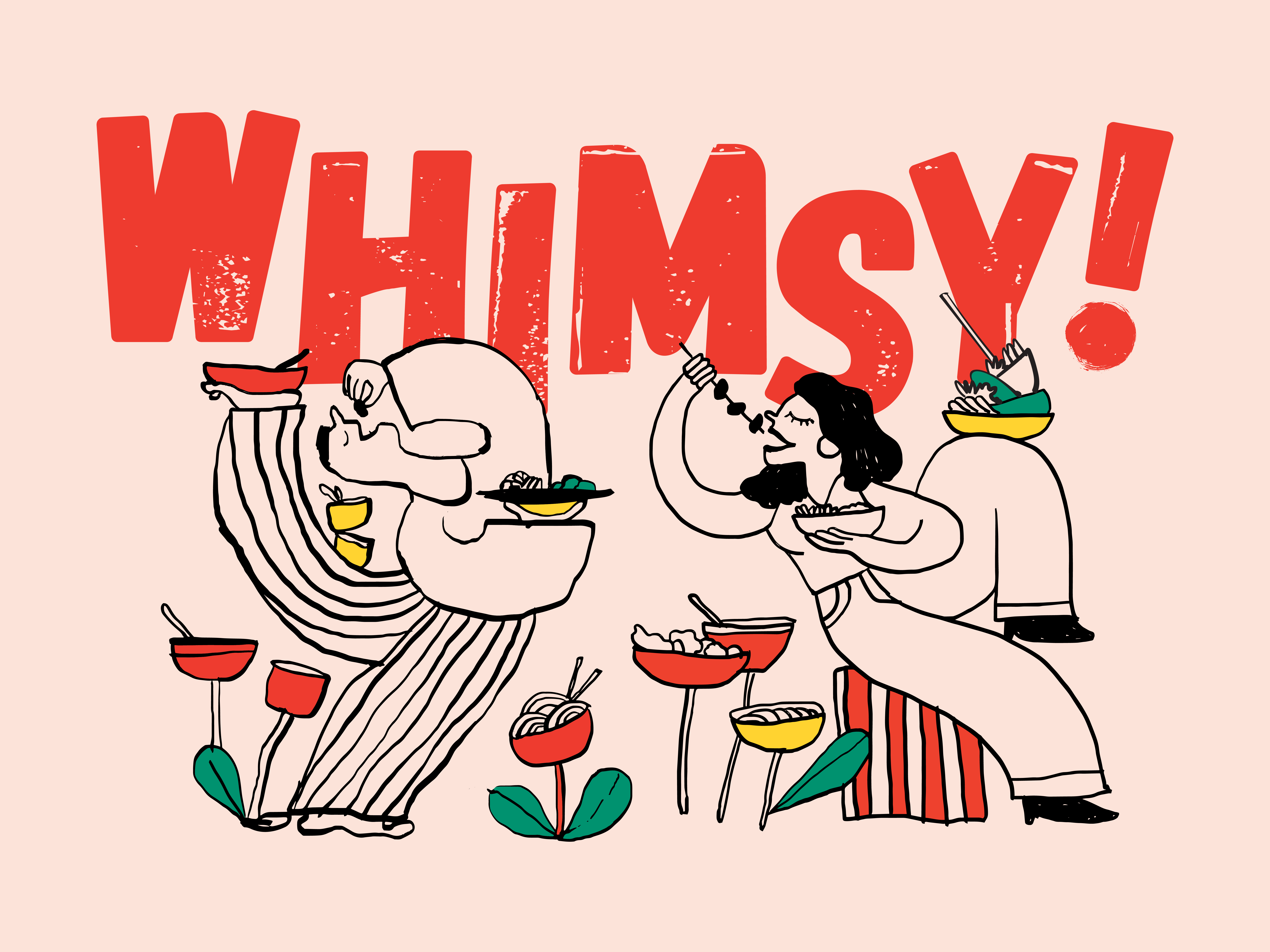
I created custom illustrations that visually narrate Anveshan’s story, highlighting provenance, traditional methods, and the connection between farm and food through a delicate, culturally rooted illustration style.
The evolution of the new logo in motion.
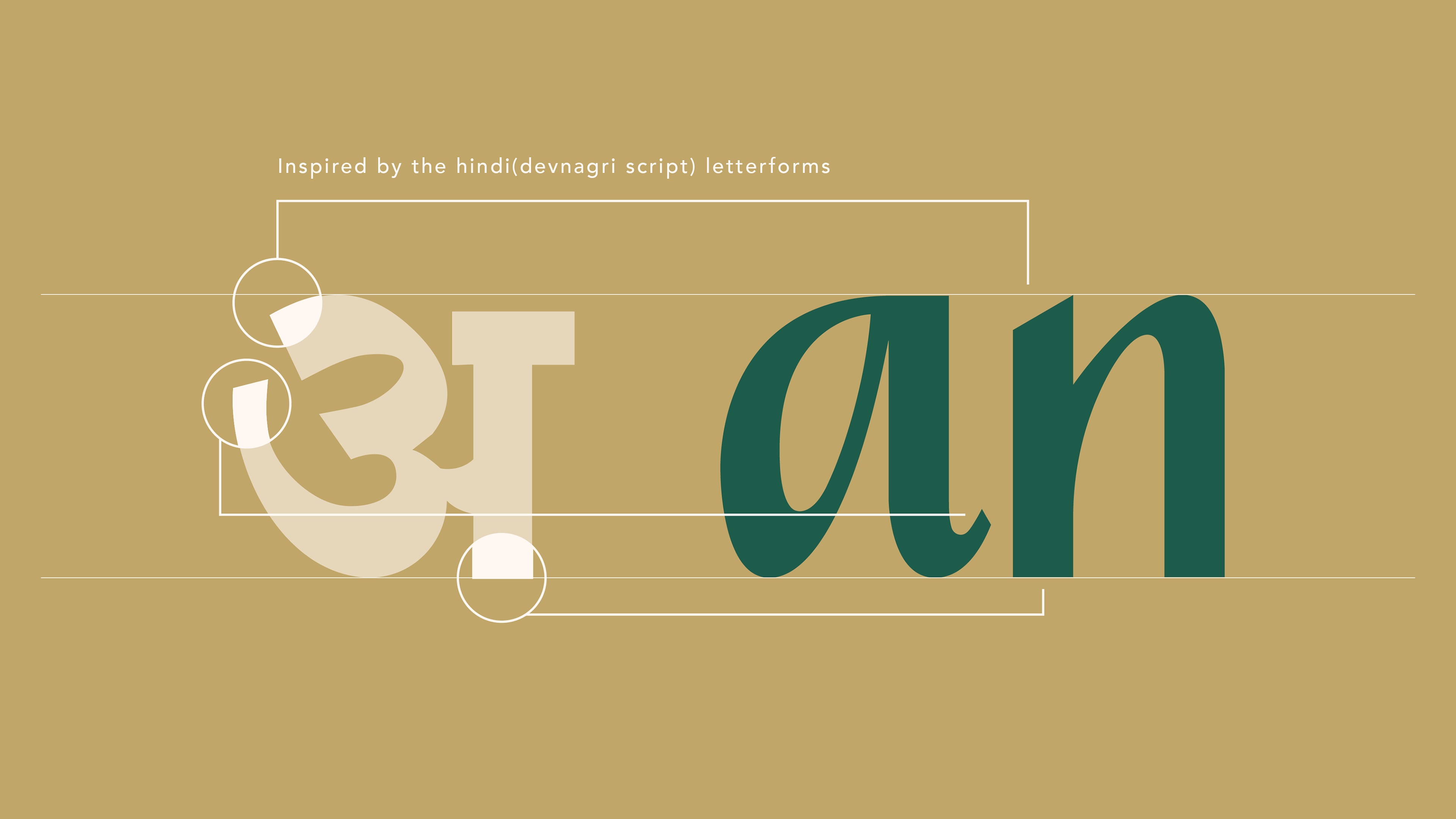
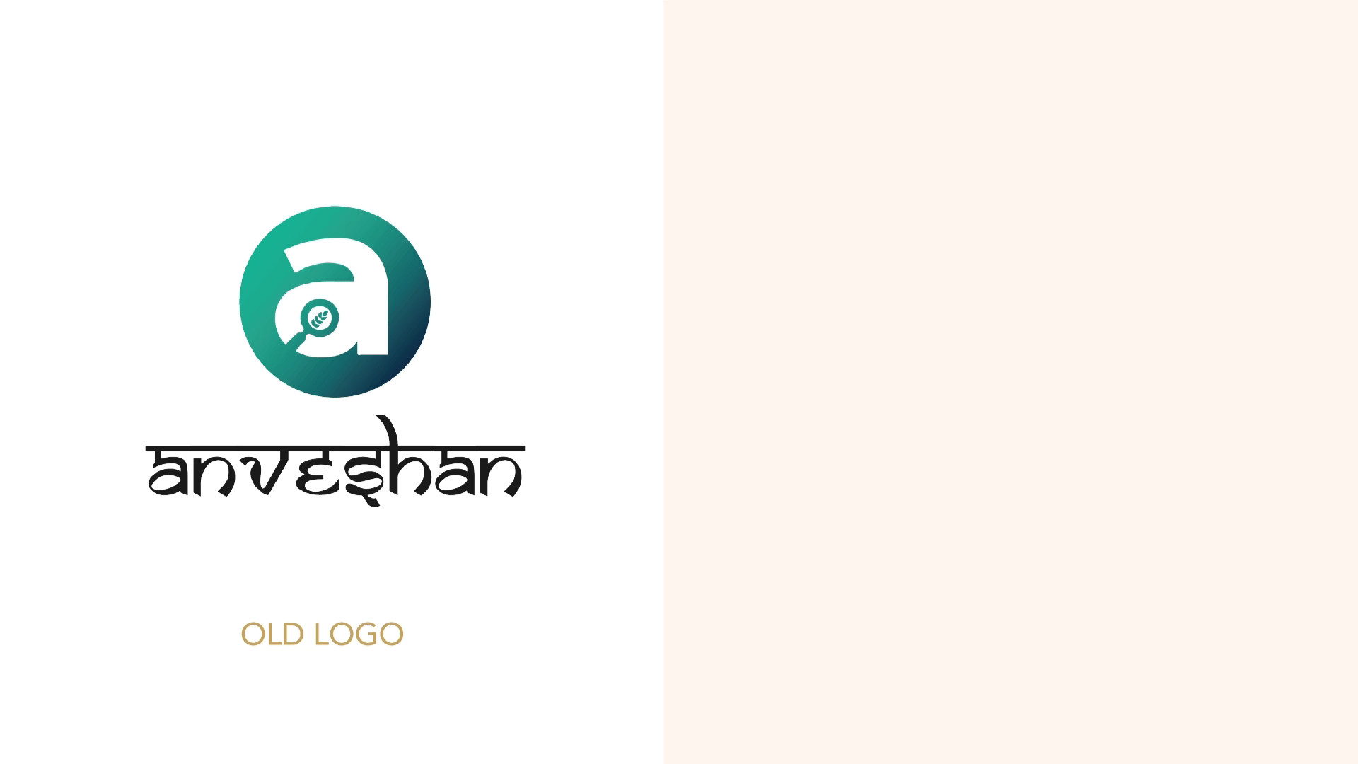
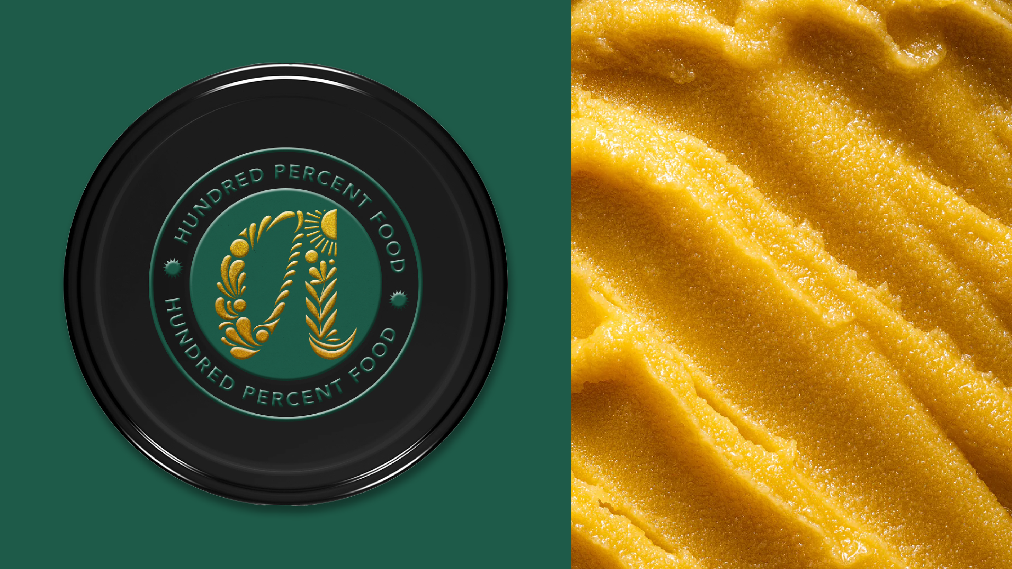
I designed a custom typographic logo for the brand, drawing inspiration from the construction of the Devanagari script (Hindi). The new logo strikes a balance between tradition and modernity. It is fresh, clean, and credible, yet deeply rooted in heritage. The primary brand colors further reinforced this narrative, symbolizing organic, innovative, and pure food practices inspired by tradition.
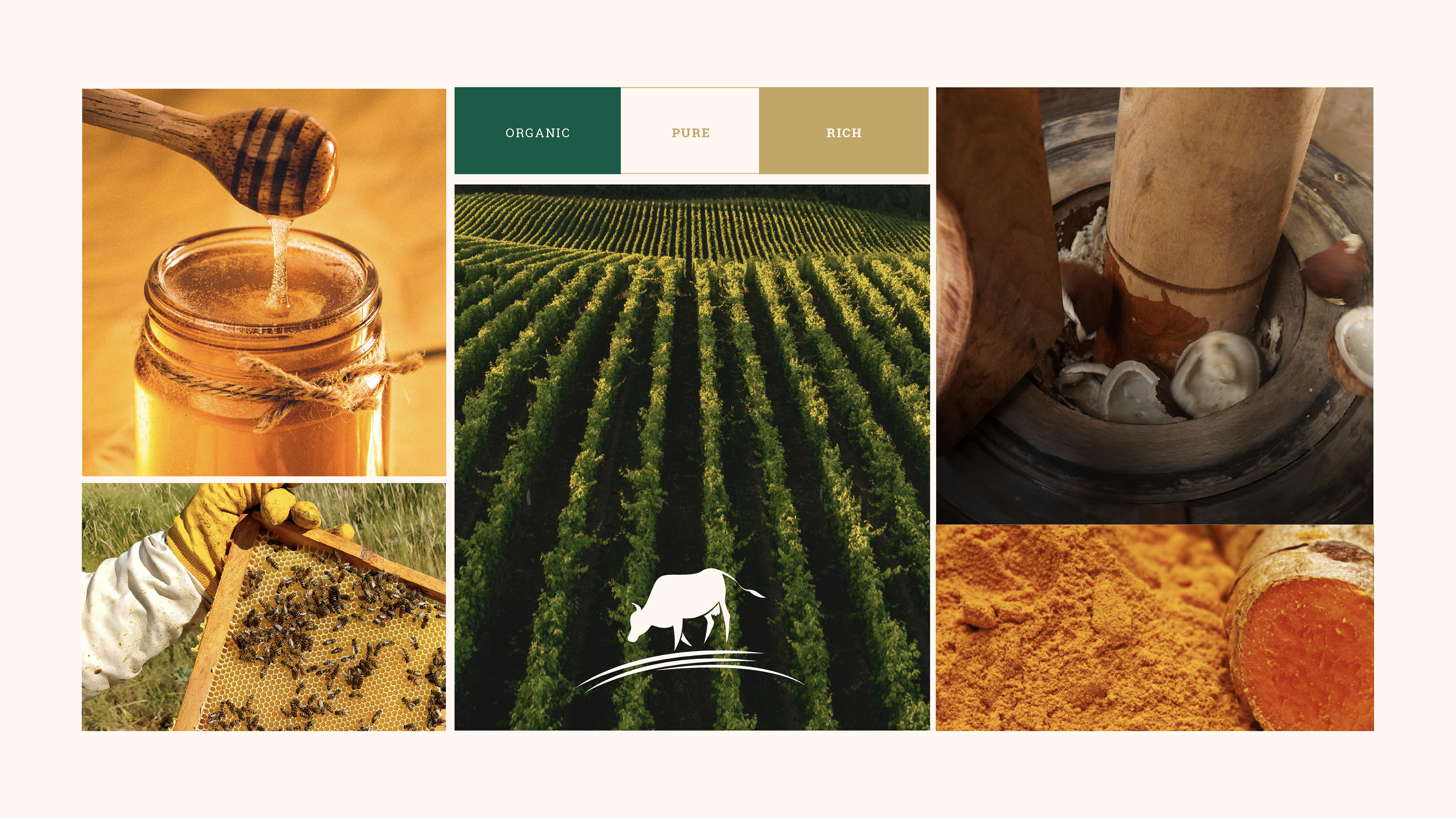
Brand Moodboard
A process video showcasing the evolution of label design, from early explorations to the final direction.
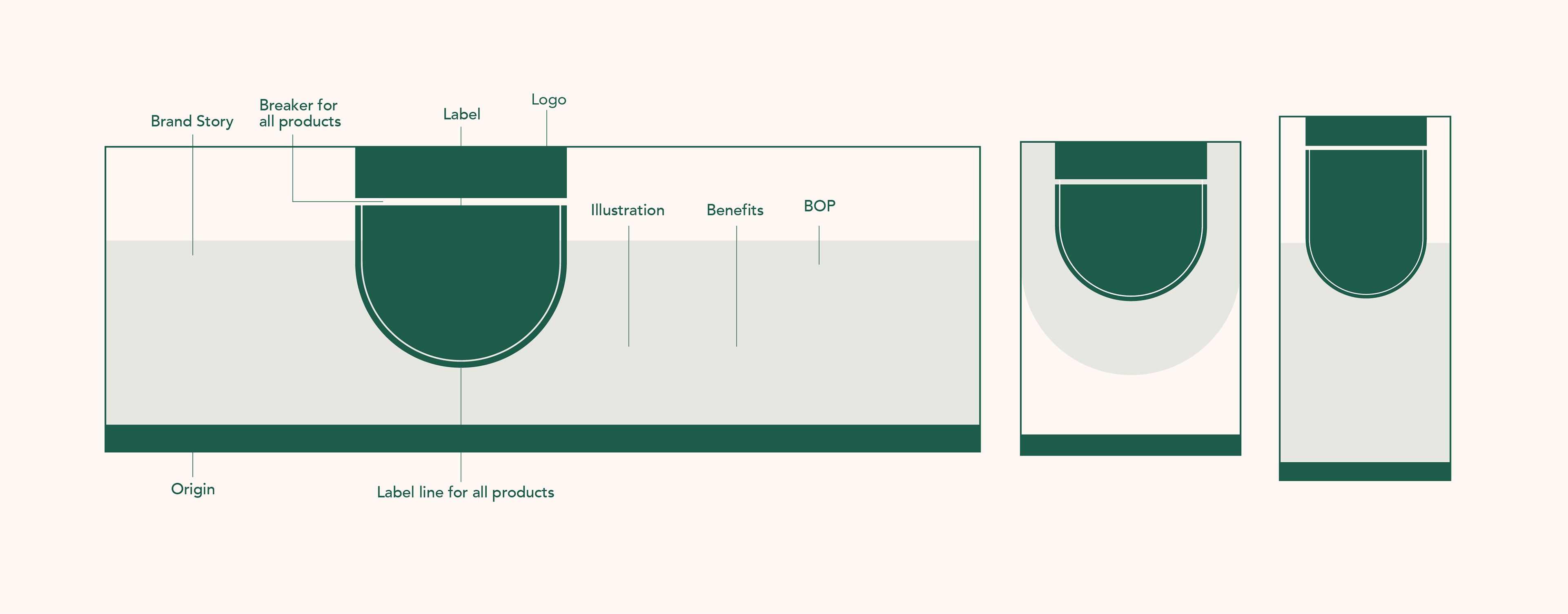
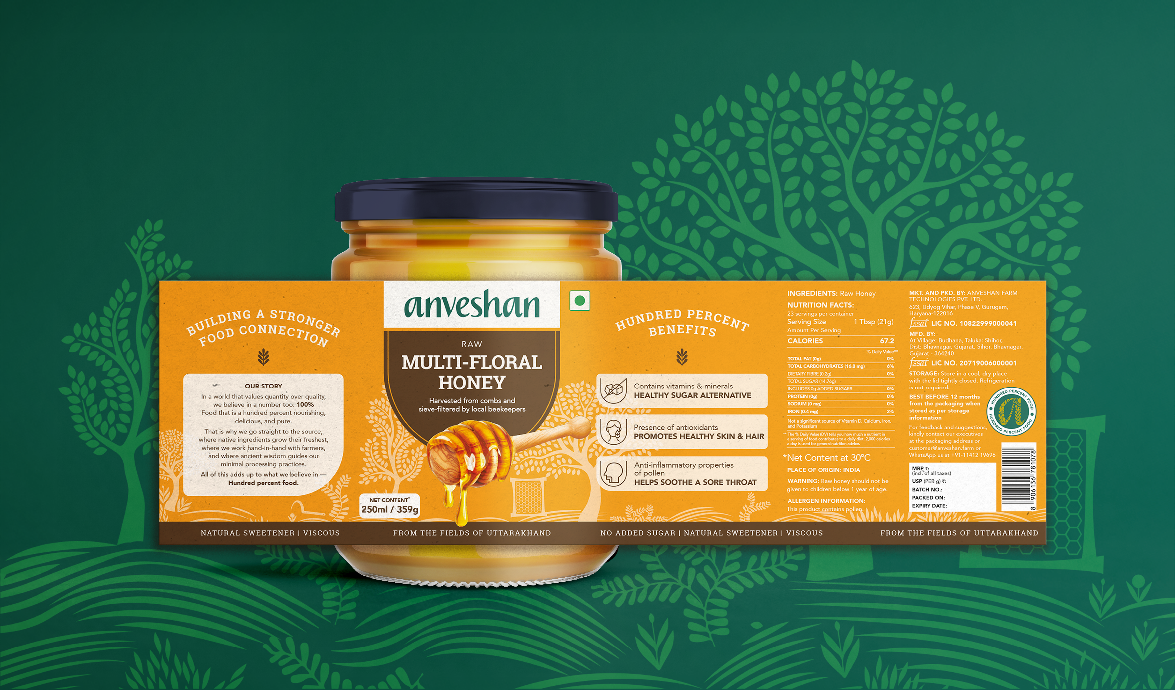
Detailed label breakdown, with each element intentionally crafted to communicate the brand story.
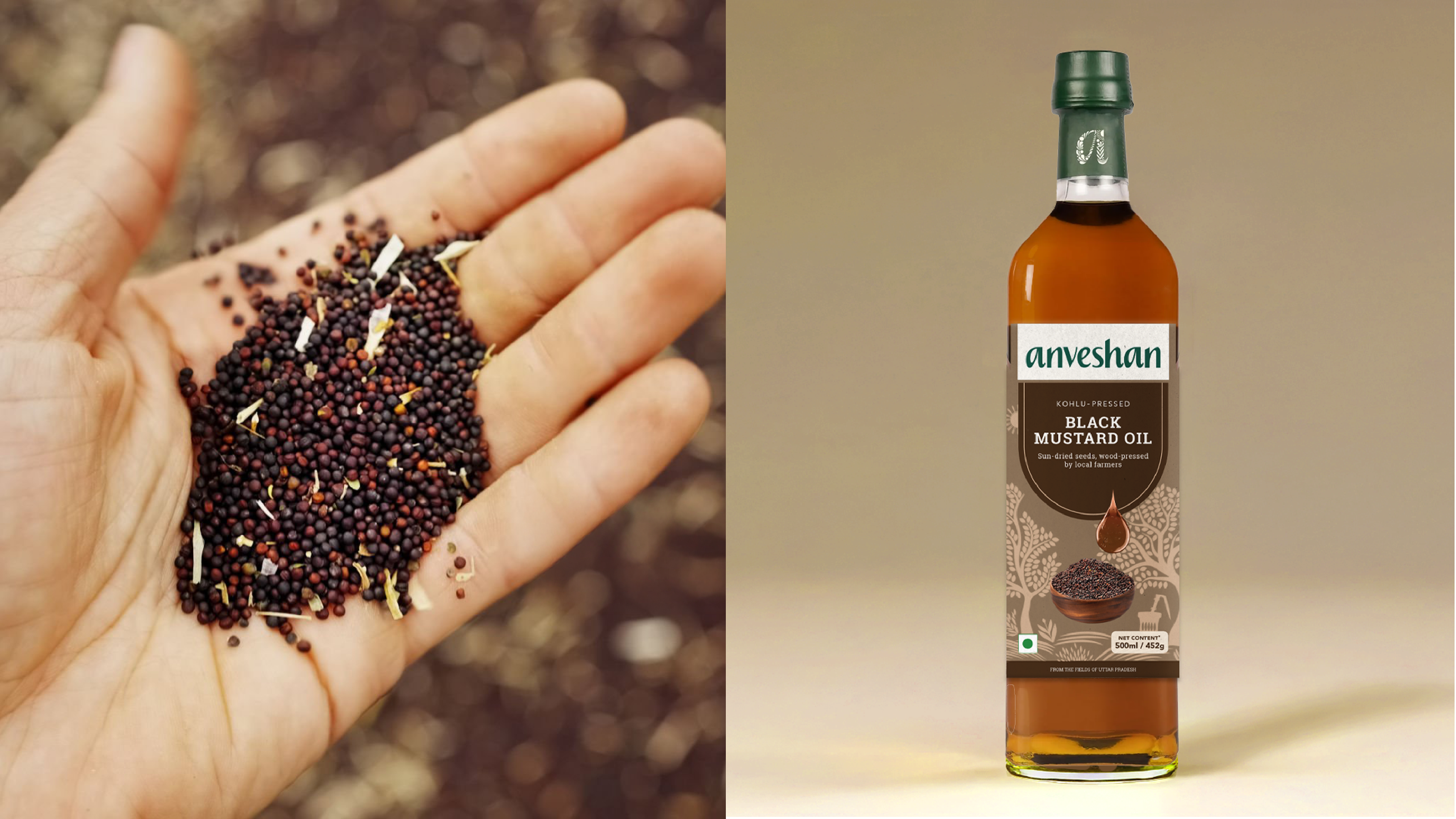
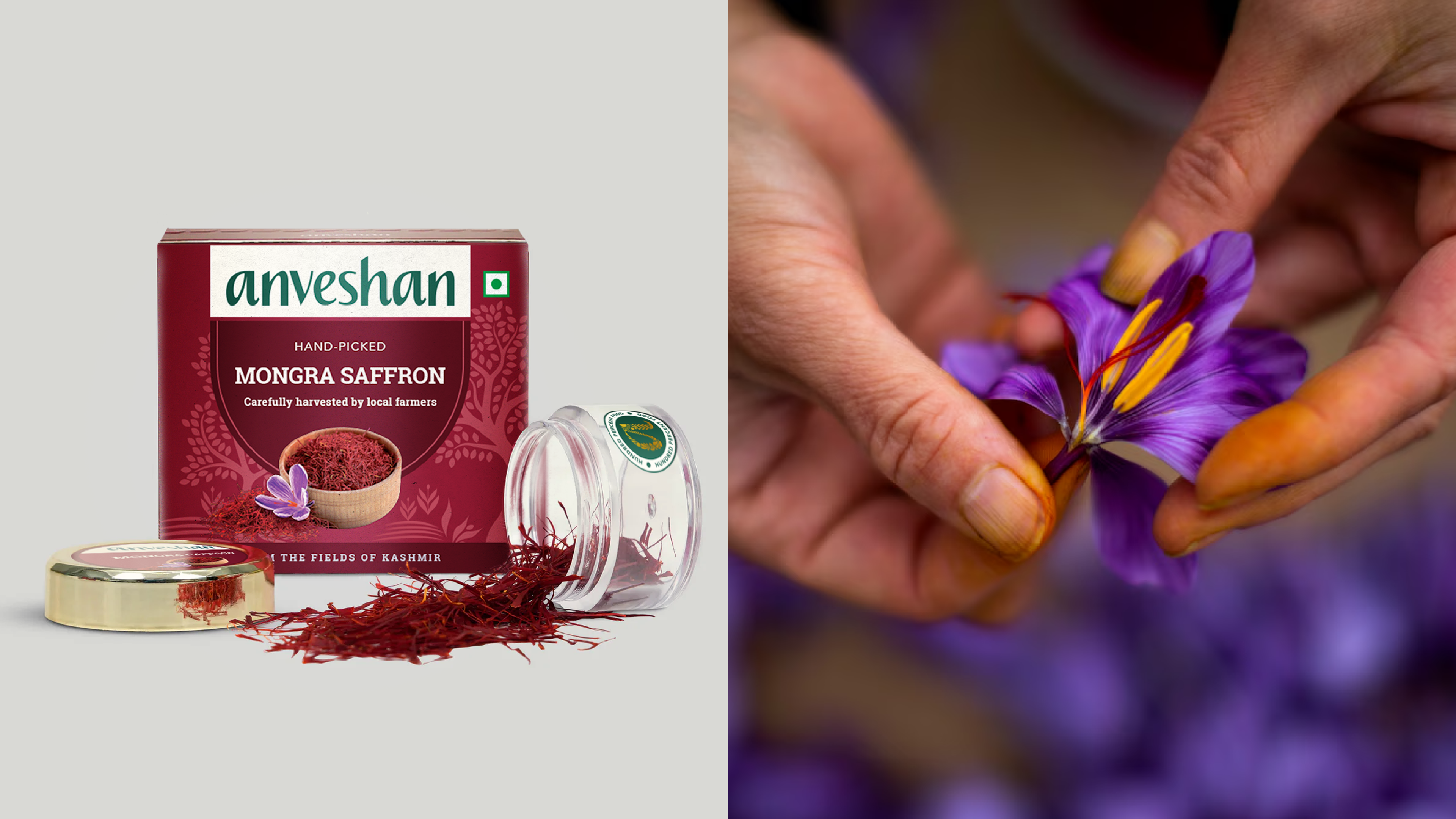
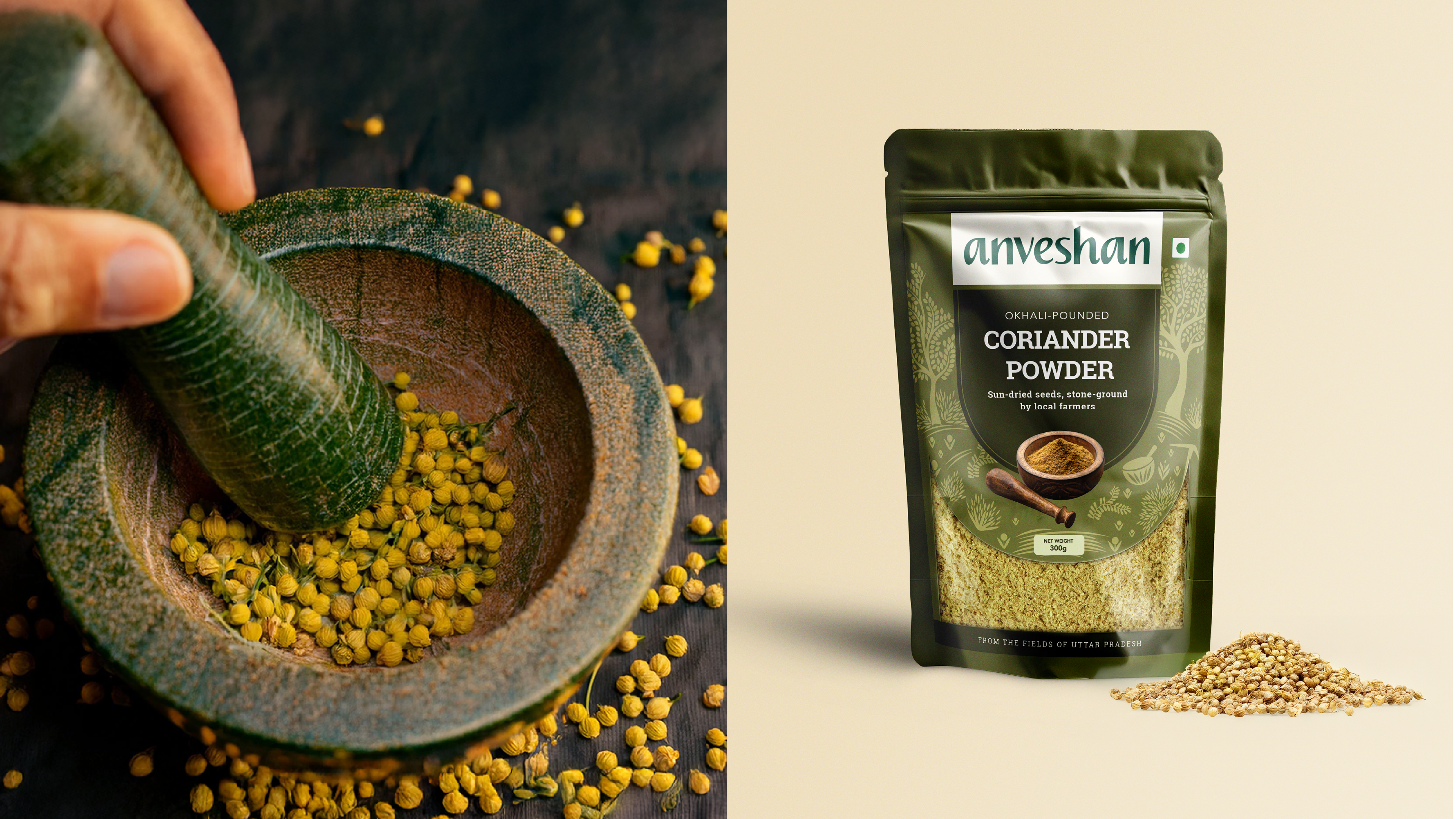
To bring clarity and consistency across the product range, I developed a strategic packaging framework that visually communicates Anveshan’s story and values. The bold 'U' shape on the front served as a focal point, anchoring the design elements, while still allowing space for storytelling. Key details like the footer were designed to reinforce trust and credibility, making purity and provenance unmistakably visible on every pack.
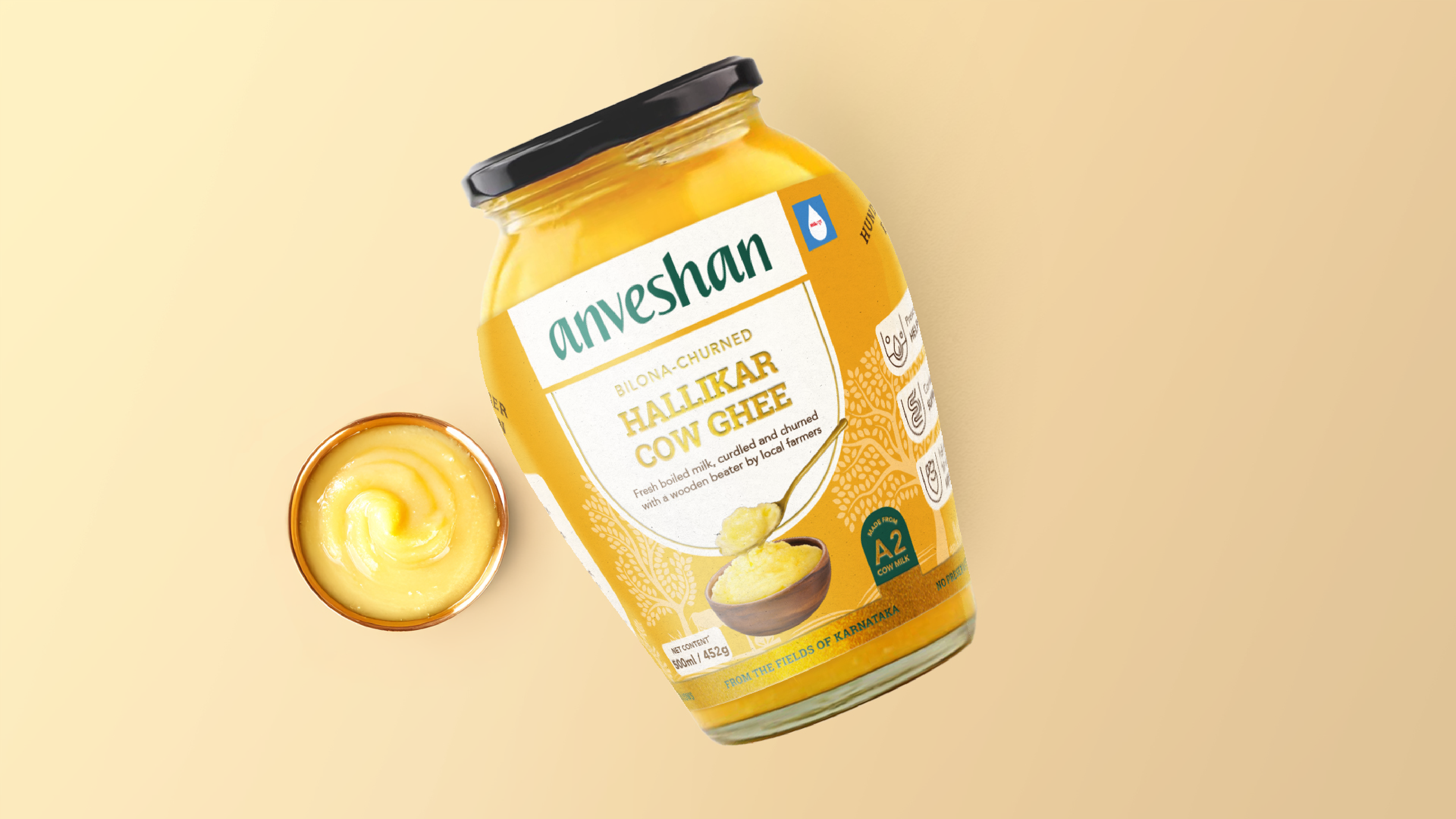
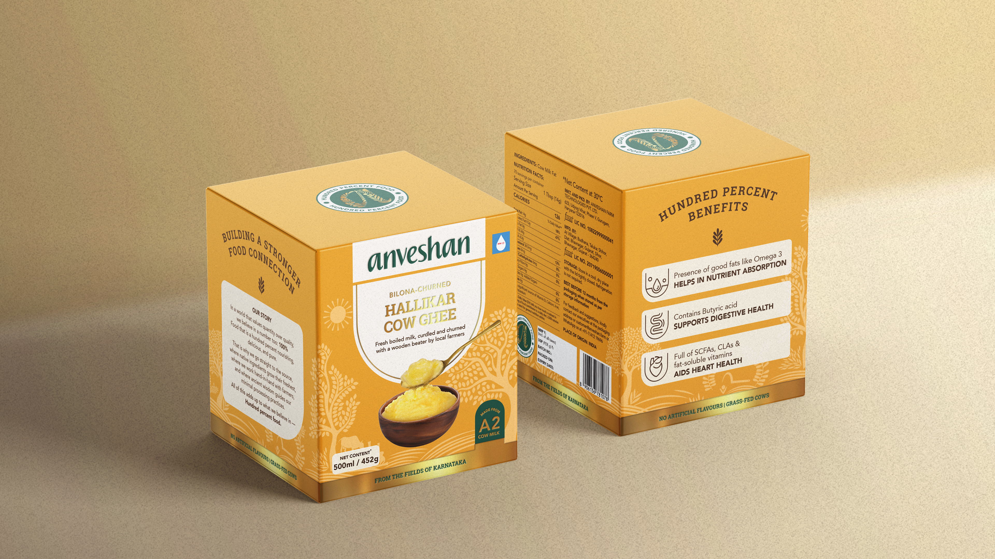
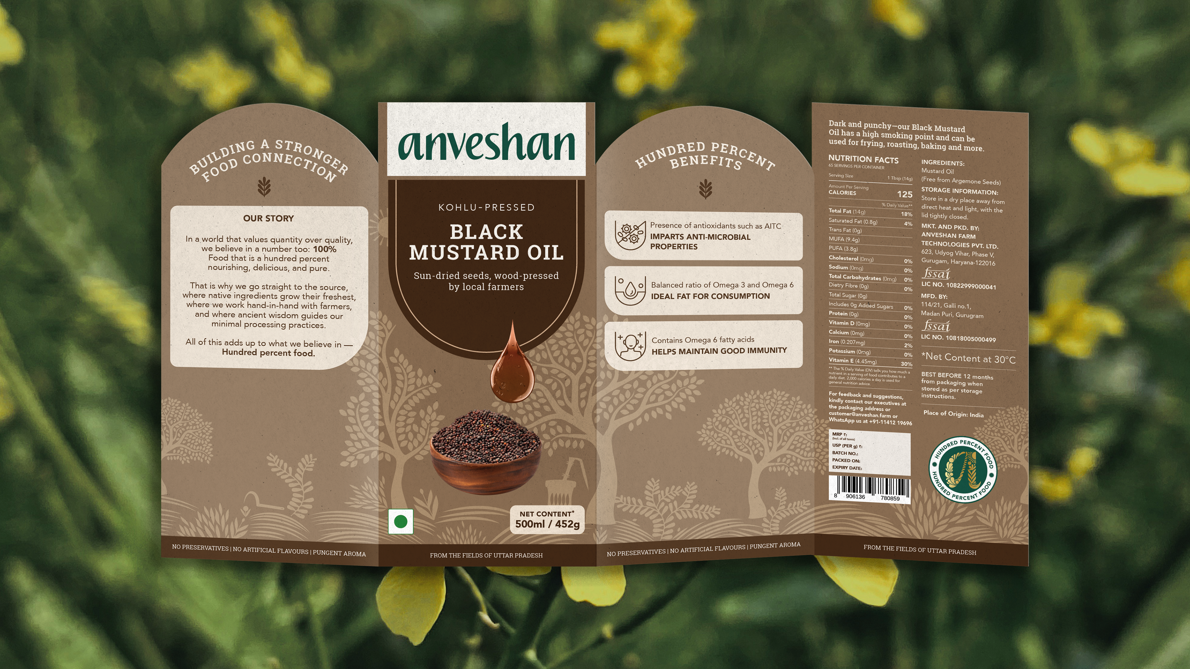
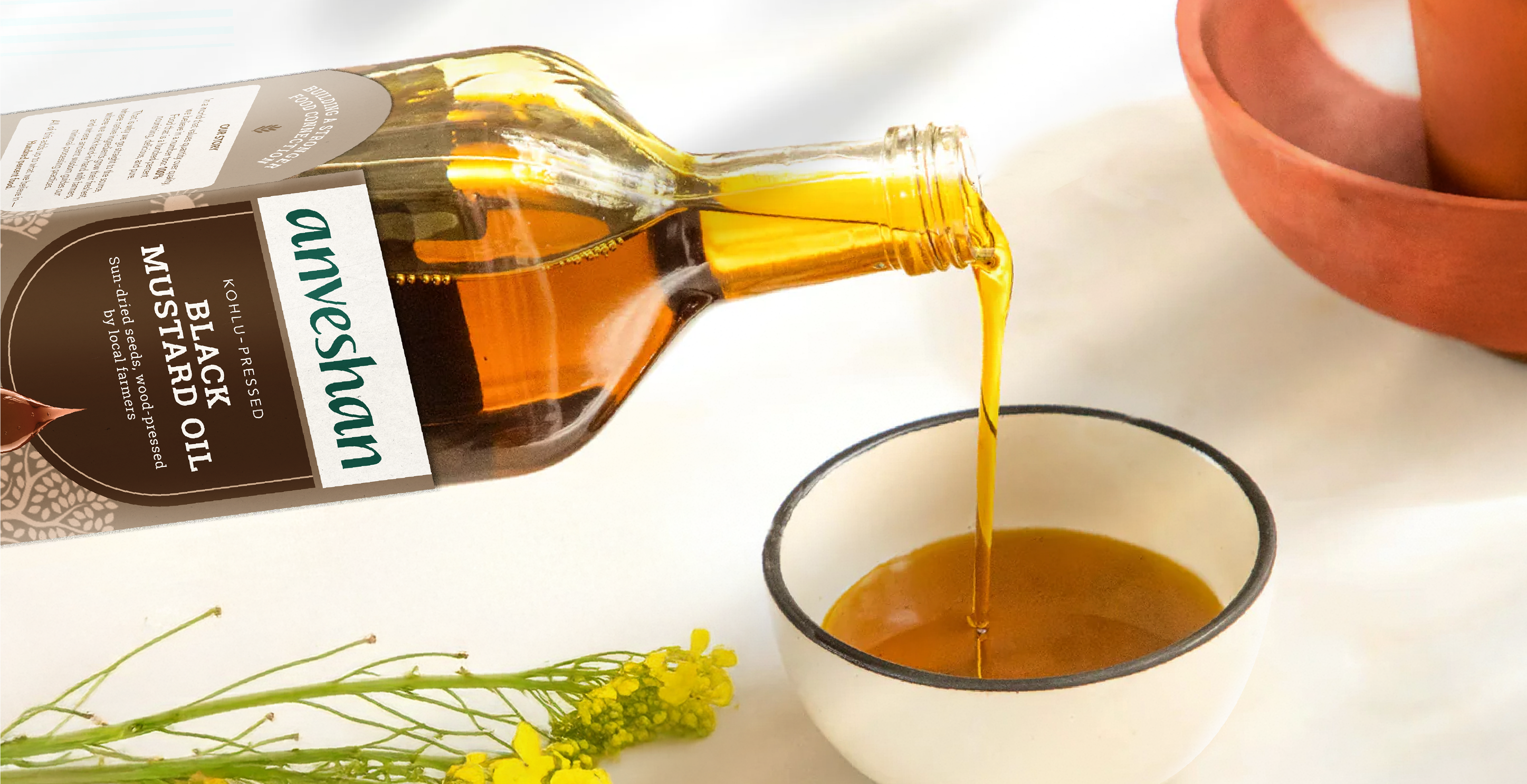
The packaging’s color system was intentionally drawn from the natural tones of the ingredients, reinforcing the brand’s promise of purity made visible. This palette not only celebrates minimally processed food but also supports product clarity across the range. As the brand’s bestseller and a premium offering, ghee was elevated with gold foiling, adding a touch of sophistication.
The branding and packaging system was successfully scaled across 65+ SKUs, proving its strength as a cohesive, scalable design language that builds trust through consistency and clarity. Following the rebrand, the company reported 2x growth, generating INR 34 Cr in revenue in FY23. The refreshed identity enhanced consumer trust, driving higher sales. By 2025, Anveshan is valued at over INR 500 Cr and boasts a thriving and growing social presence.
Role: Creative Direction | Design | Illustration | Motion Graphics
Agency: Please See//
Team Lead: Imran, Karno
Copywriter: Subhannita
Brand Manager: Lizanne, Madiha
Strategy: Richa, Ashish
Team Lead: Imran, Karno
Copywriter: Subhannita
Brand Manager: Lizanne, Madiha
Strategy: Richa, Ashish