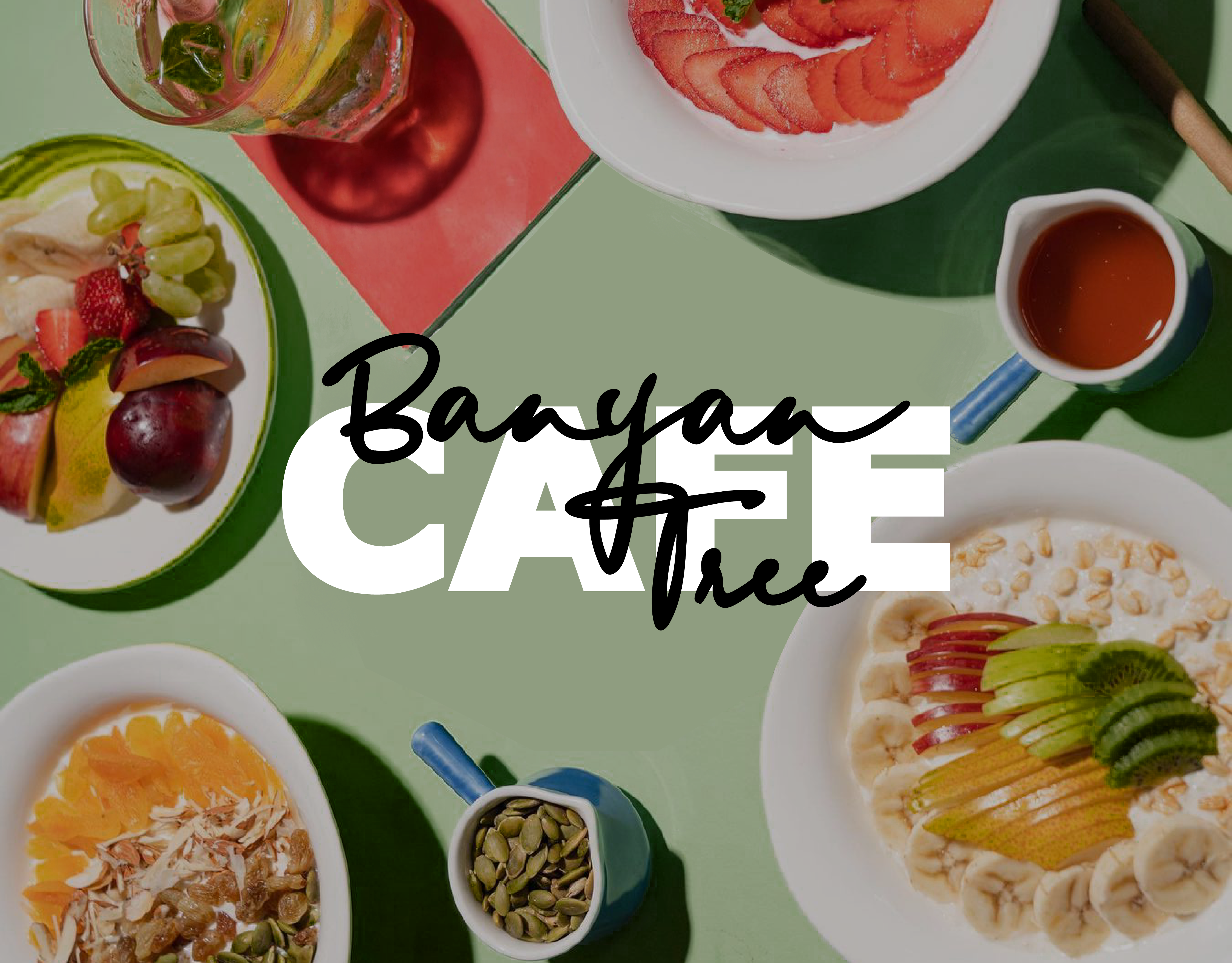
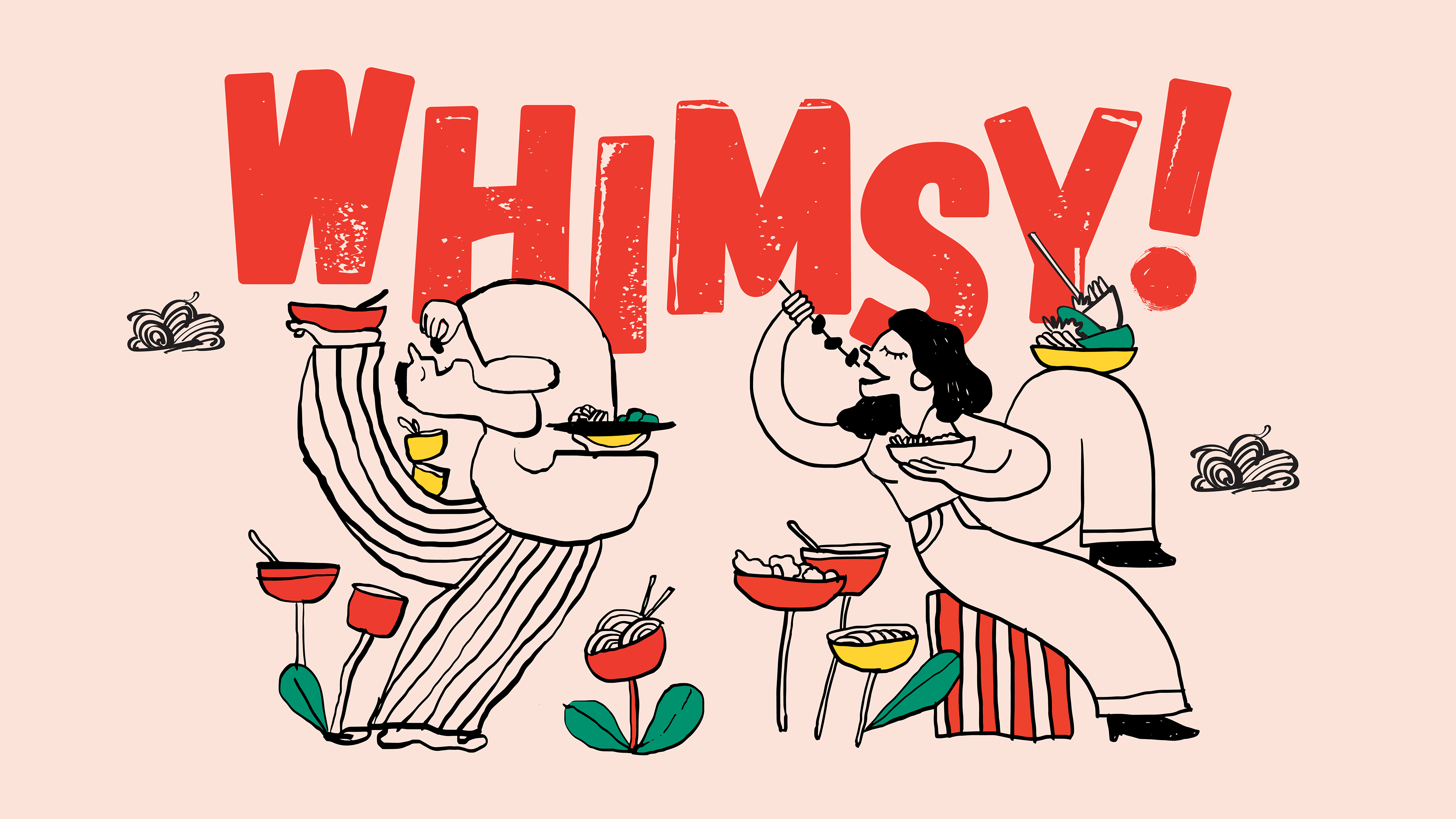
Custom hand-drawn brand illustration and brand logo for Whimsy
Indians love buffets! This brand set out to recreate the buffet experience of limitless choices from a cloud kitchen straight to your home.
It broke away from limited menus and rigid meal structures, offering complete freedom over what and how you eat. And so, the name Whimsy was born.
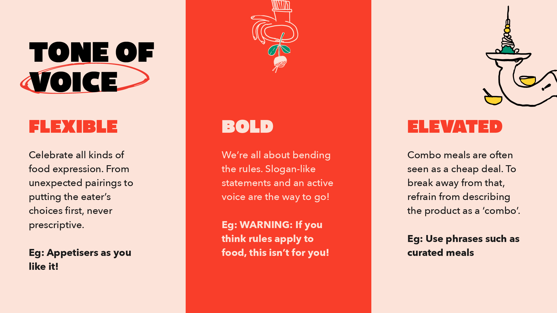
The idea was to position Whimsy as a rule-breaking, joy-forward food brand that reimagines the traditional meal experience by putting the power of choice back in the eater’s hands through bold design, playful storytelling, and a build-your-own-box model.
For the brand’s visual identity, I drew inspiration from the brand’s positioning, a boundless feeling that comes with ordering from Whimsy. I designed a dynamic wordmark, where the playful arrangement of letterforms reflects the brand’s spirited essence and the freedom of choice.
The color story is bold and vibrant, just like the excitement of the food itself. The primary brand colors, red, yellow, and green, were selected to evoke freshness and excitement, mirroring the vibrant flavors offered by Whimsy.
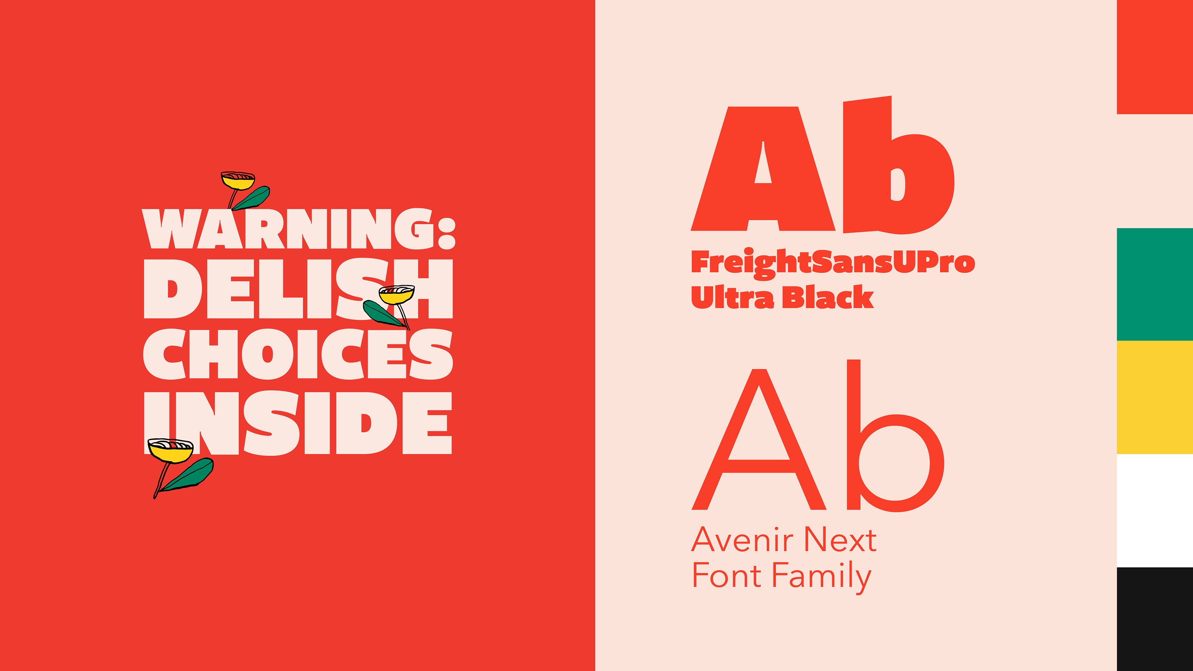
The typography features a heavy-weight font, perfectly capturing the essence of a grand buffet experience that is abundant and satisfying.

Delivery boxes design and core brand promises as brand icons.
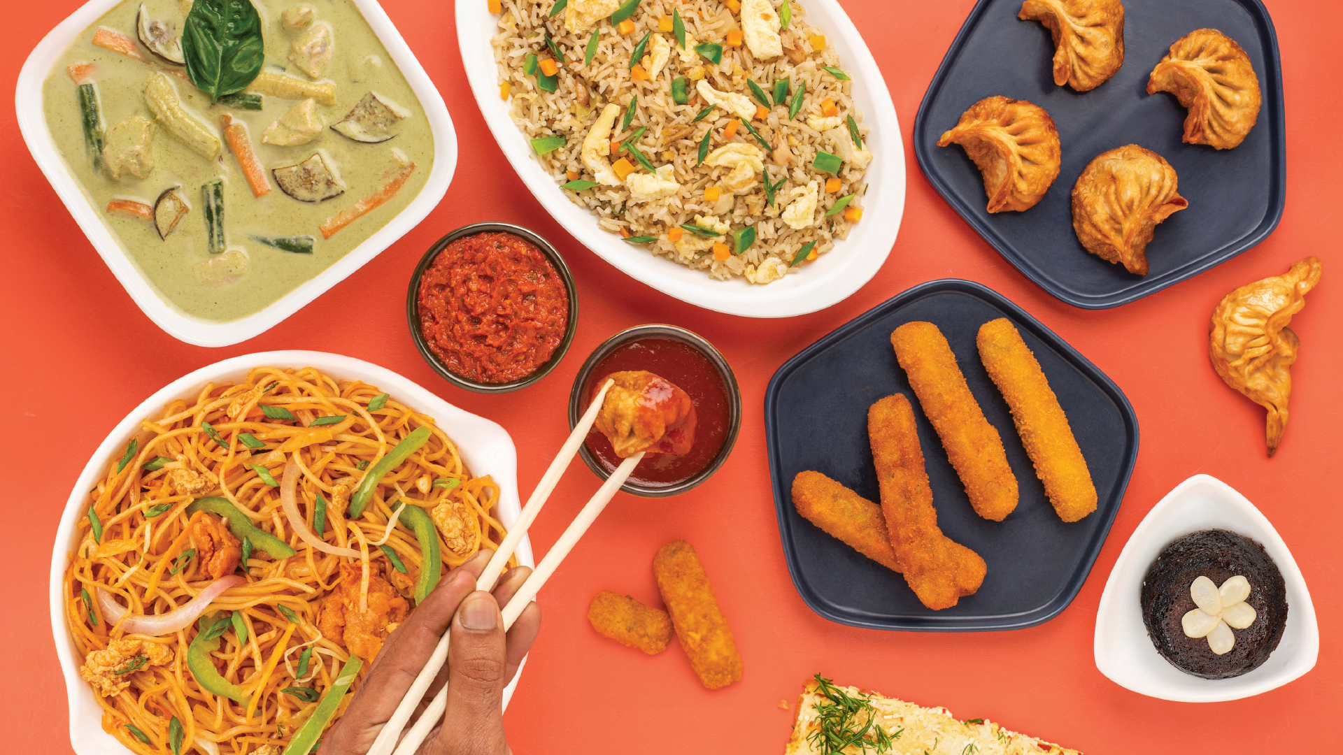
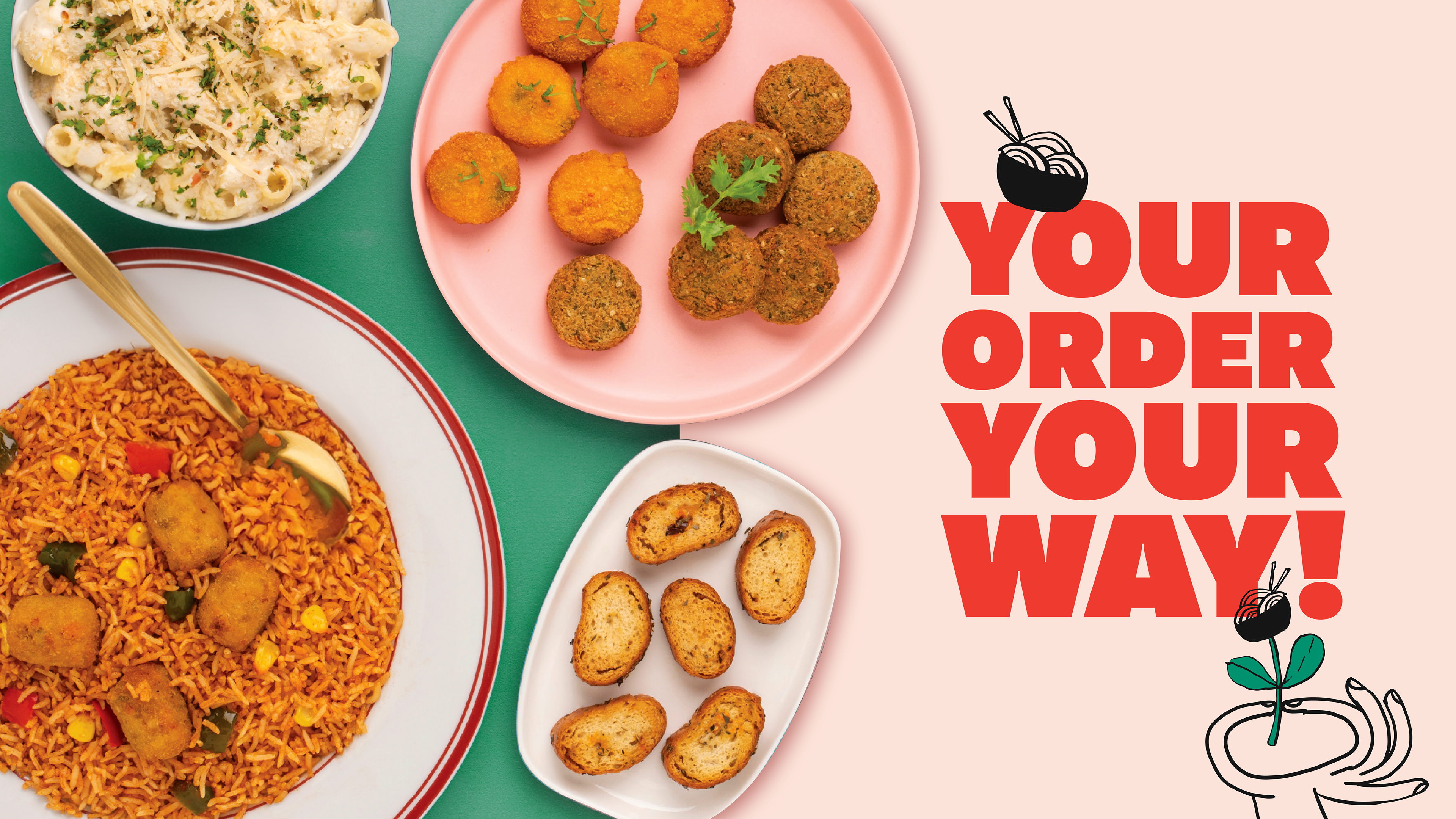
Food photography for the brand
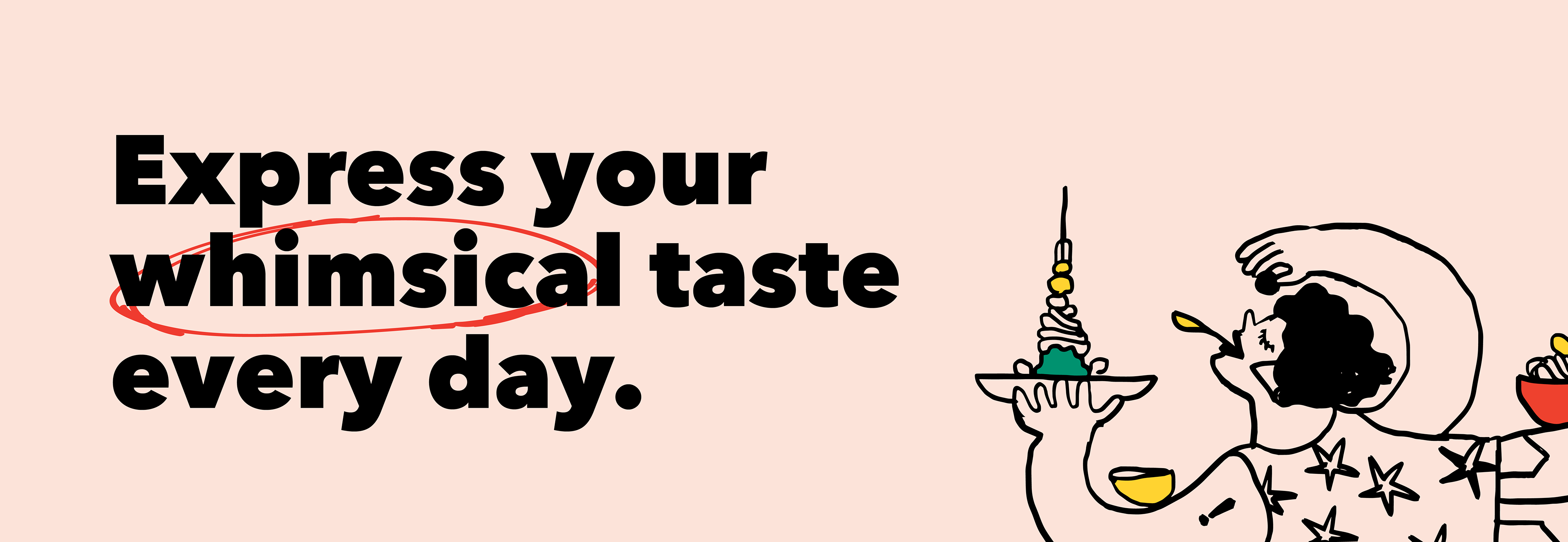
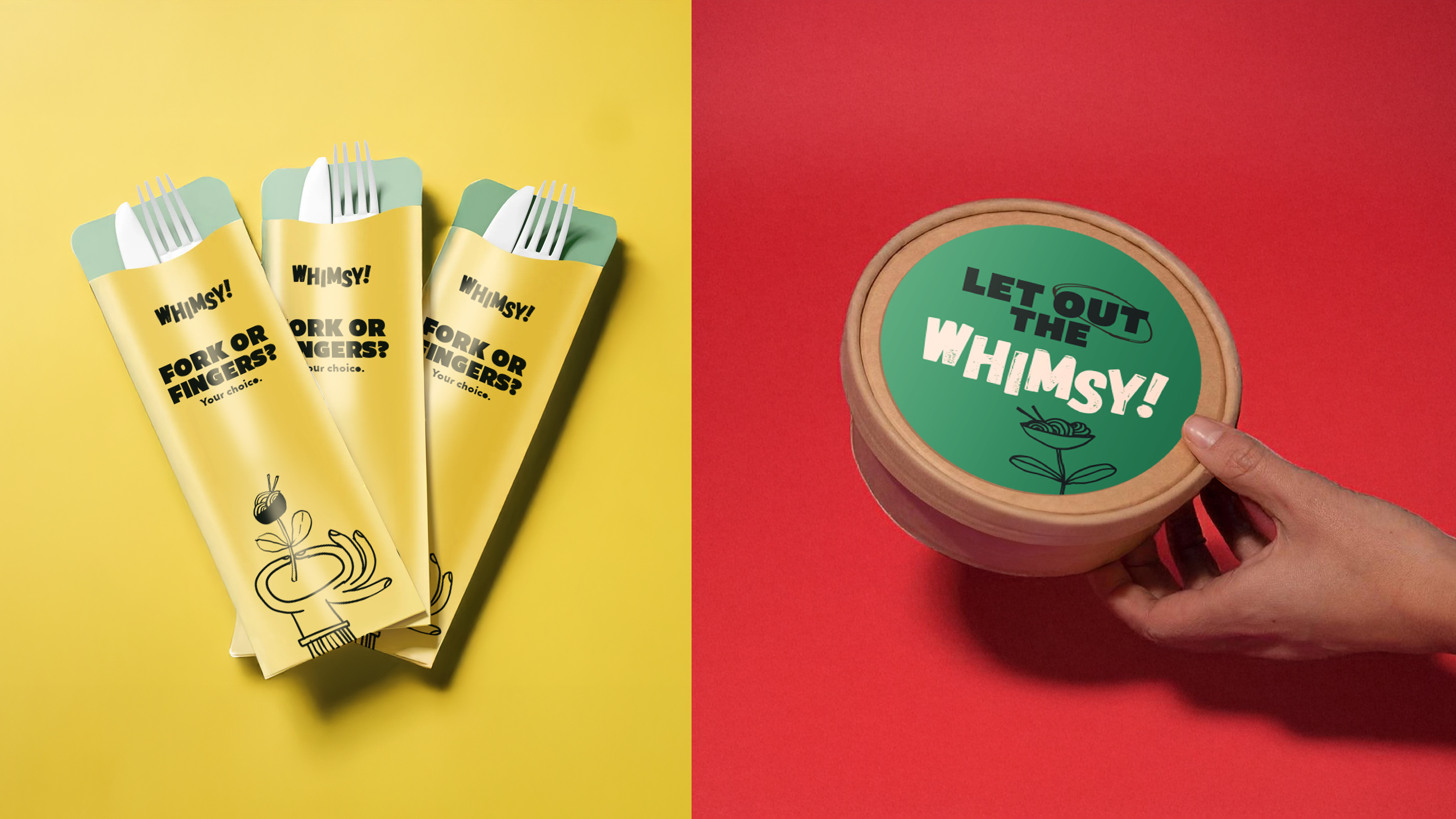
The hand-drawn illustrations serve as a visual extension of Whimsy's brand story, capturing the joy and spontaneity of mixing cuisines and breaking food norms. These illustrations not only enhance the whimsical ambiance but also create an emotional connection with the audience.
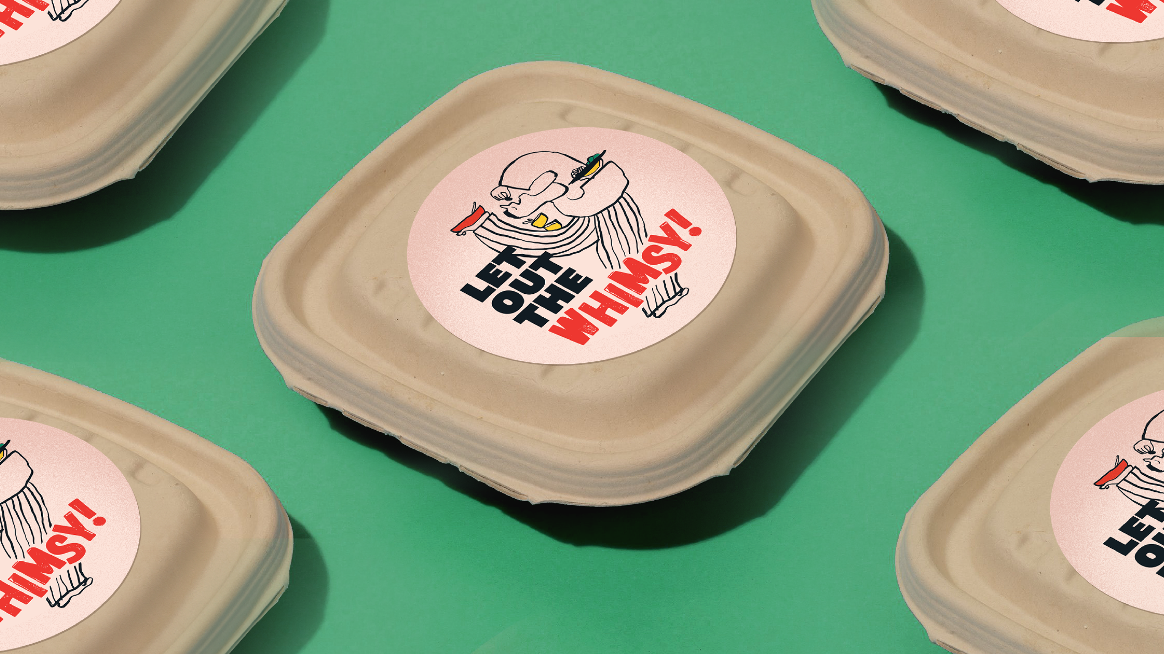
The packaging featured printed corrugated boxes for the outer layer, while containers were stamped and sealed with branded stickers. Playful and engaging copy on the packaging enhanced the brand’s whimsical personality, making every unboxing experience fun and exciting.
The brand also took over social media with a fun, bold take on food that perfectly matches its boundless spirit. Each post celebrates individuality and flavor, inviting users to embrace their “whimsical taste” by mixing cuisines, breaking food norms, or just adding a little extra spice to their daily scroll.
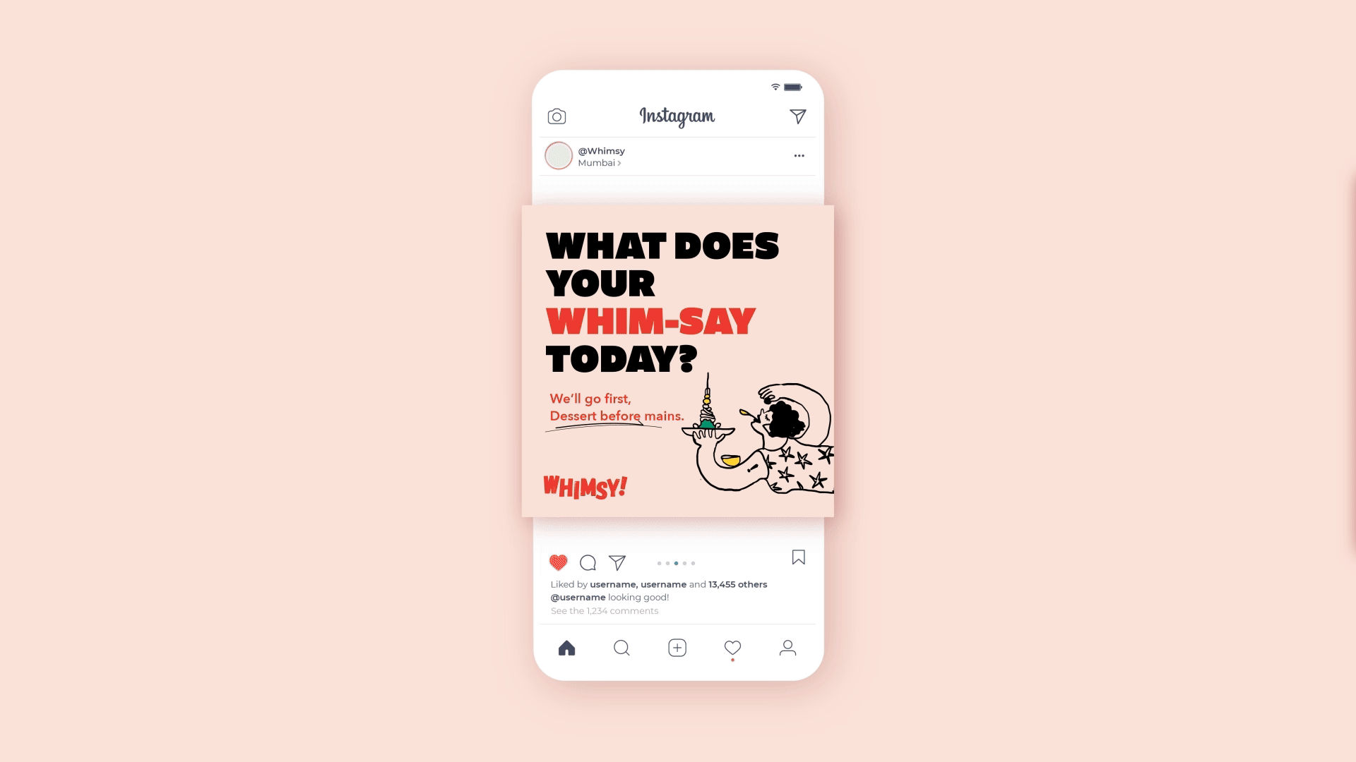
Social Media posts that tell the brand story across digital platforms

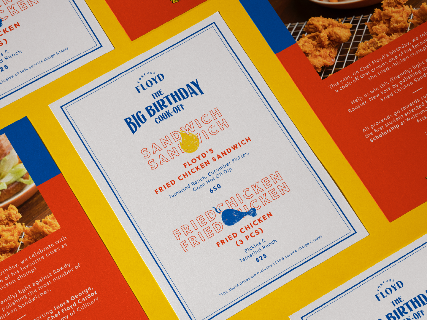
Notecard Design
Role: Design | Illustration
Agency: Please See//
Team Lead: Kassandra
Copywriter: Subhannita, Adele
Brand Manager: Lizanne
Team Lead: Kassandra
Copywriter: Subhannita, Adele
Brand Manager: Lizanne