An animation that depicts the story of how the banyan tree inspired the branding system for the Cafe.
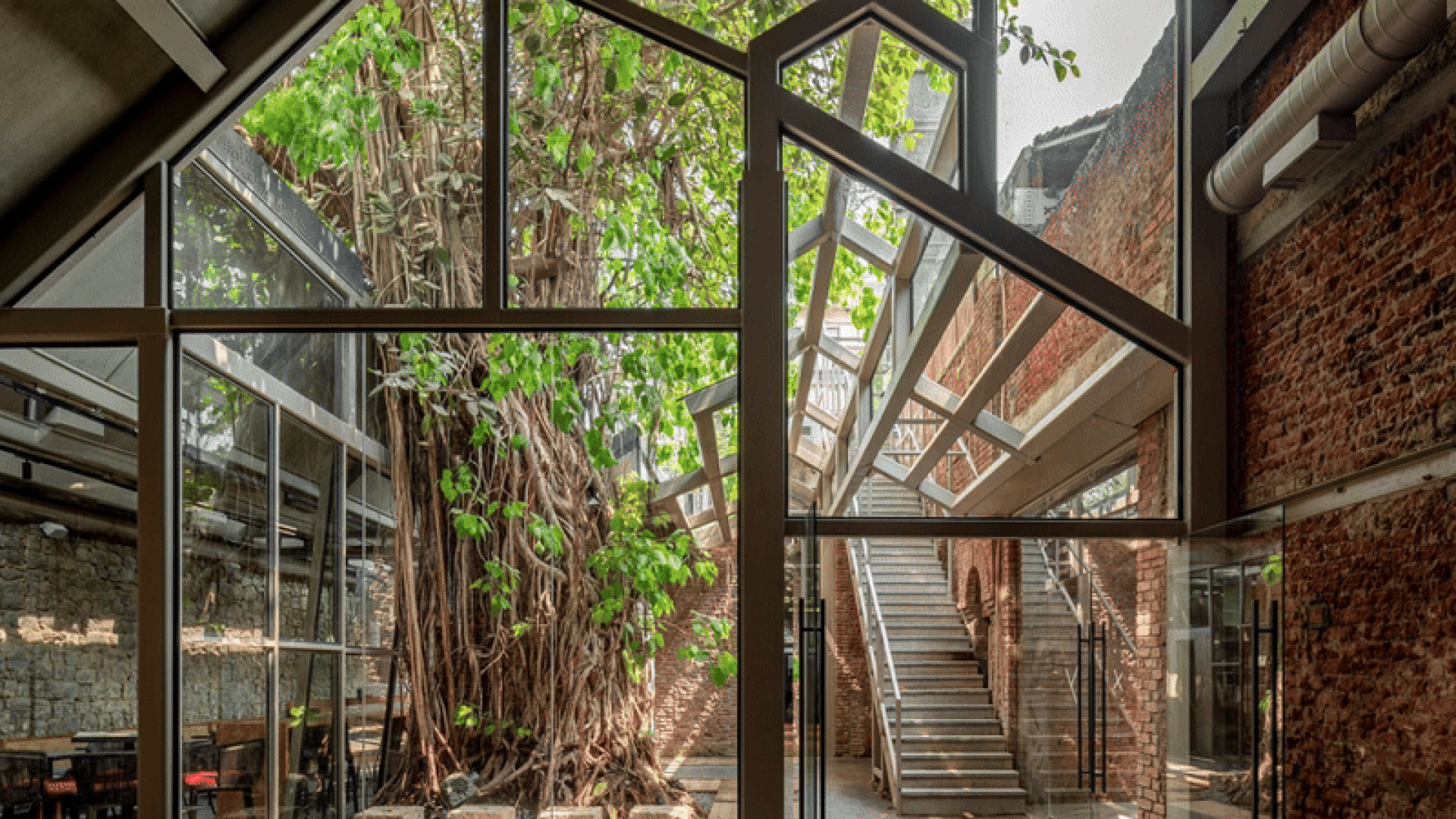
A 140-year-old former ice factory in Mumbai has been transformed into IF.BE, a 10,000 square foot experimental architecture and art venue, featuring a magnificent 150-year-old banyan tree at its center. Beneath its canopy sits Banyan Tree Café, which aims to offer a fresh experience centered on healthy eating in a bustling city. Inspired by the tree, the cafe was named Banyan Tree Cafe. The original industrial architecture has been largely preserved, maintaining a raw and visceral character.
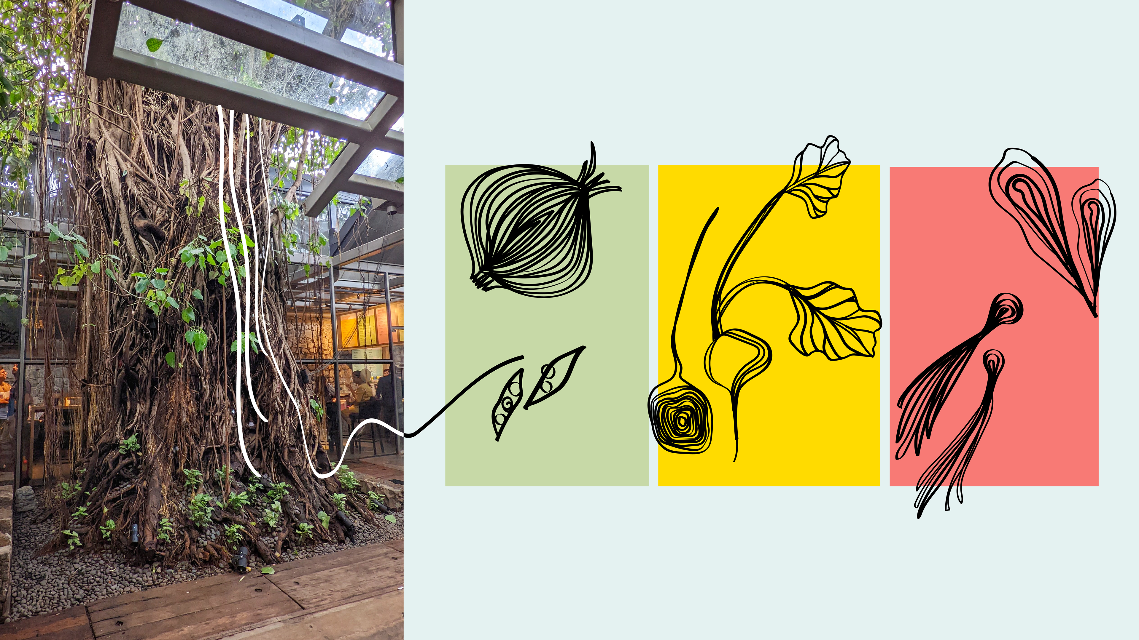
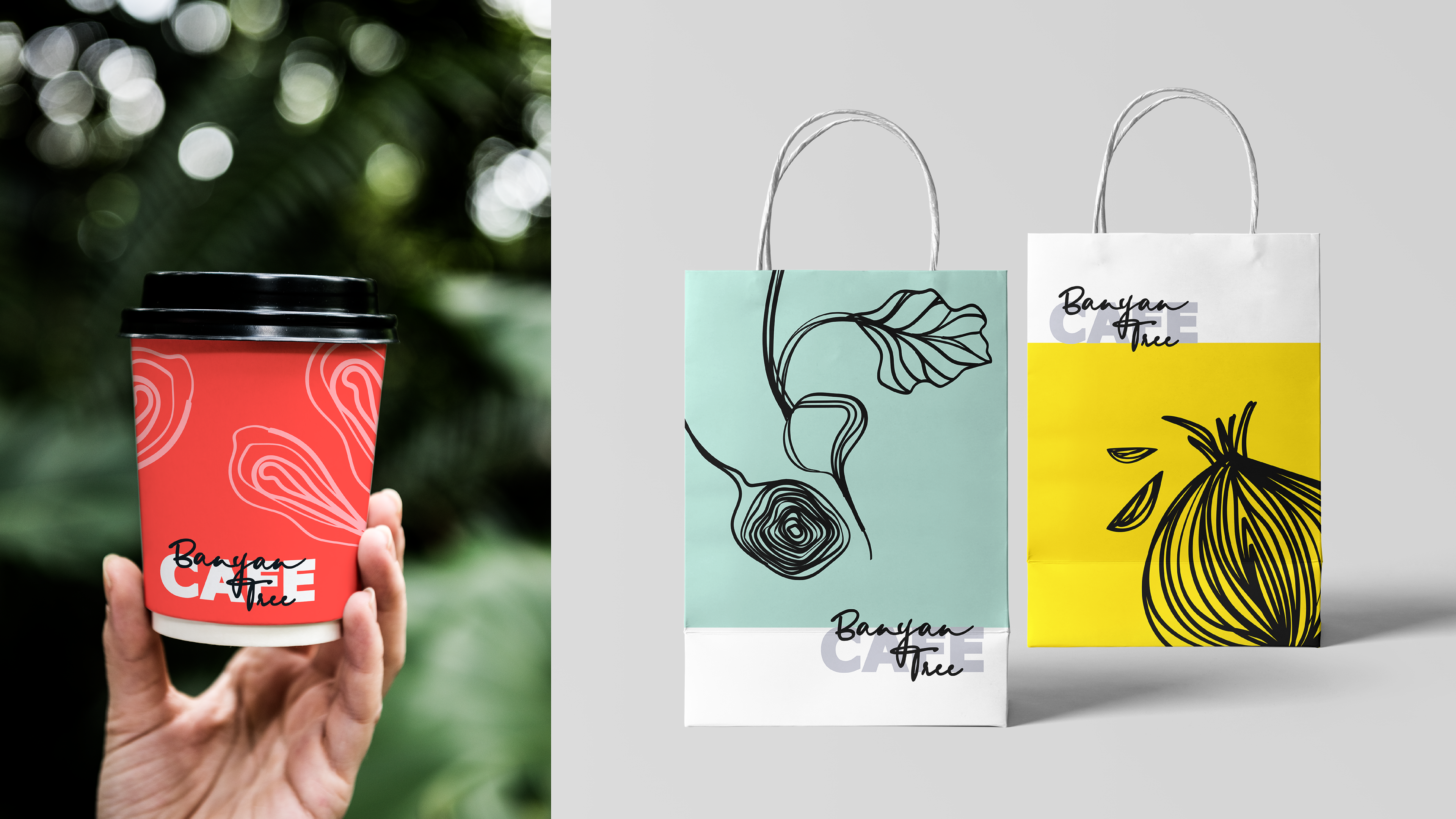
The beautiful aerial roots of the tree inspired the custom illustration and the typographic logo.
CHALLENGE:
The café needed a brand identity that balanced its raw, industrial setting with warmth and vibrancy, all while making salads and wholesome food feel fresh, fun, and exciting, without tipping into preachiness.
The café needed a brand identity that balanced its raw, industrial setting with warmth and vibrancy, all while making salads and wholesome food feel fresh, fun, and exciting, without tipping into preachiness.
SOLUTION:
I embraced this challenge by using what might be considered a dull space to my advantage and drawing inspiration from the banyan tree itself. In India, the banyan tree has long been a witness to life, a place for village meetings, stories, and gatherings.
This cultural anchor became the foundation for a vibrant design system that transformed a stark industrial space into a lively, welcoming café through a custom typographic logo rooted in the tree’s organic forms, illustrations, colors, and patterns that brought rhythm and energy into the brand world and a playful tone of voice that made healthy food sound artisanal, fun, and full of personality.
The result was a brand experience that felt urban yet approachable, hearty yet light, transforming not just the café’s atmosphere but how people engaged with healthy food.
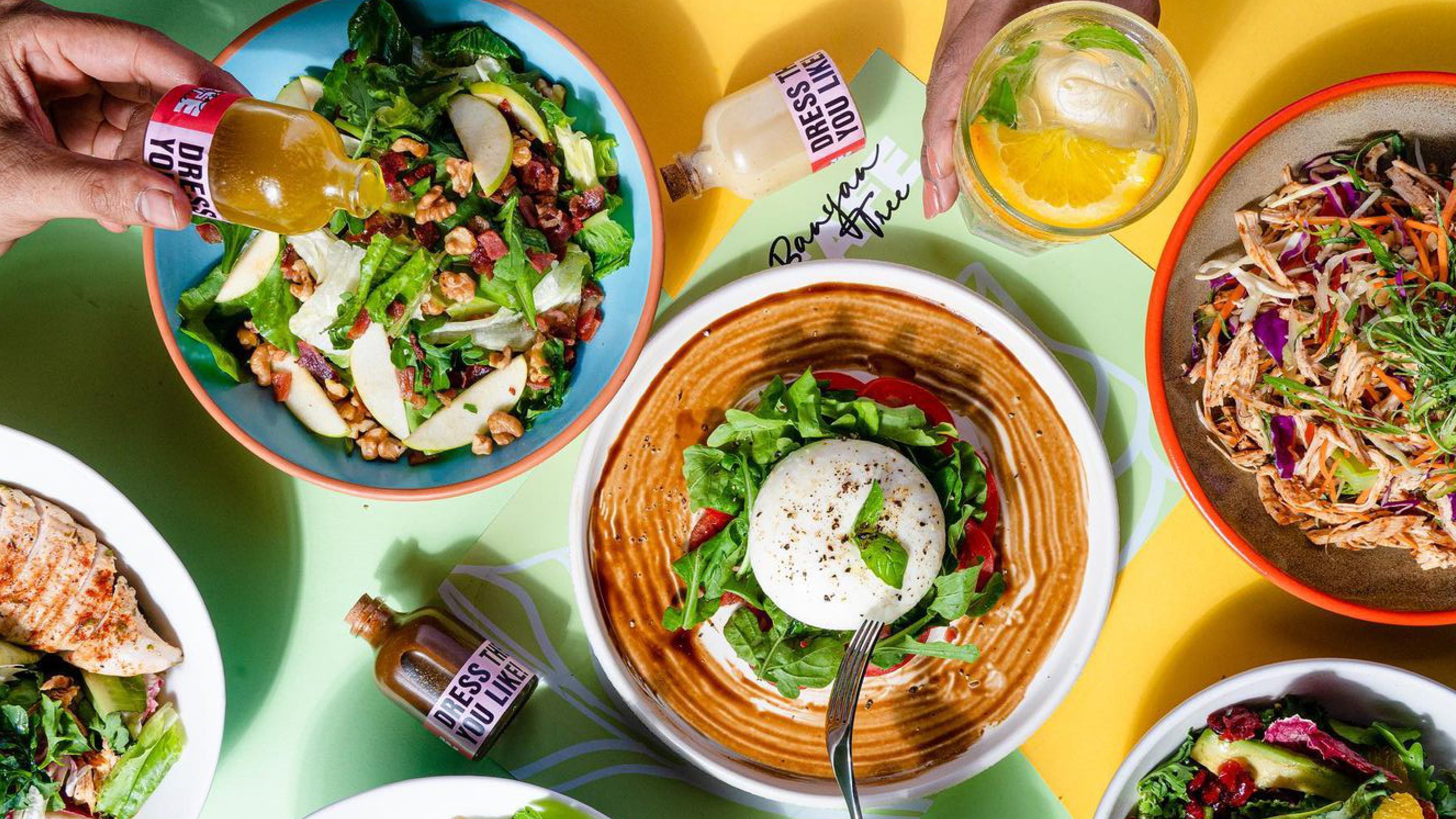
IDEA: Transform the experience of eating healthy food by approaching it through energy and care, mirroring the banyan tree’s symbolism of rootedness and nurturing. The café’s commitment to detail, from their terrace garden to adopted farms, became a guiding thought: Everything we create is nurtured with obsession: Grown, Tossed, Cooked, Mixed, Stirred, Created, and Picked with Obsession!
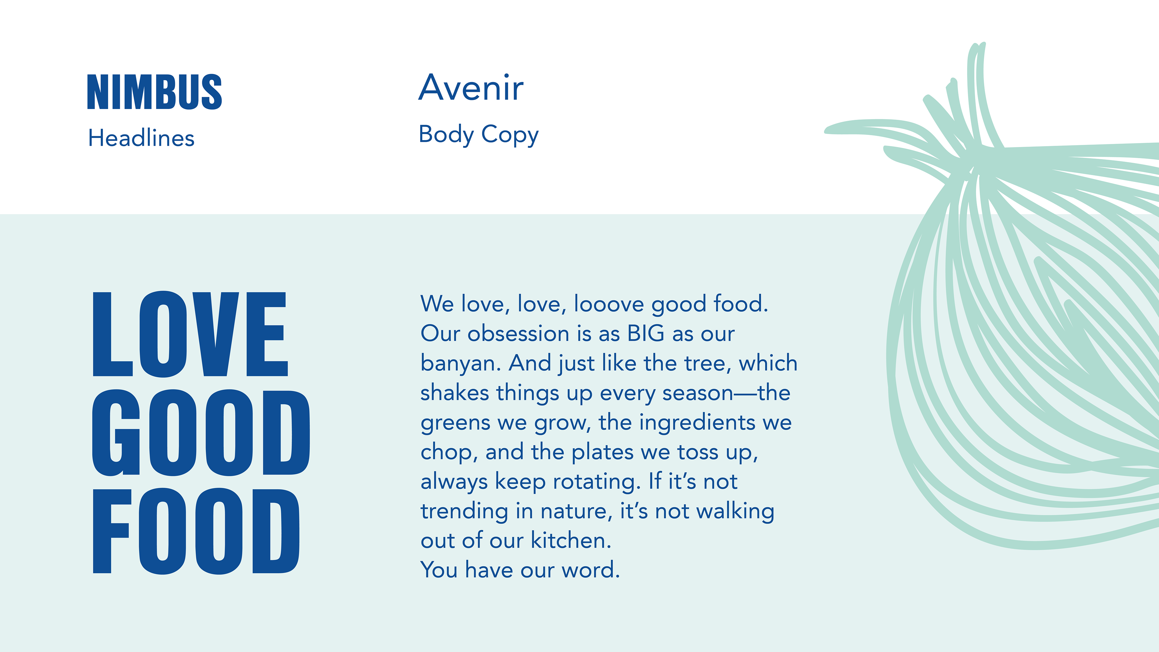
Primary and secondary typeface along with the Brand Manifesto
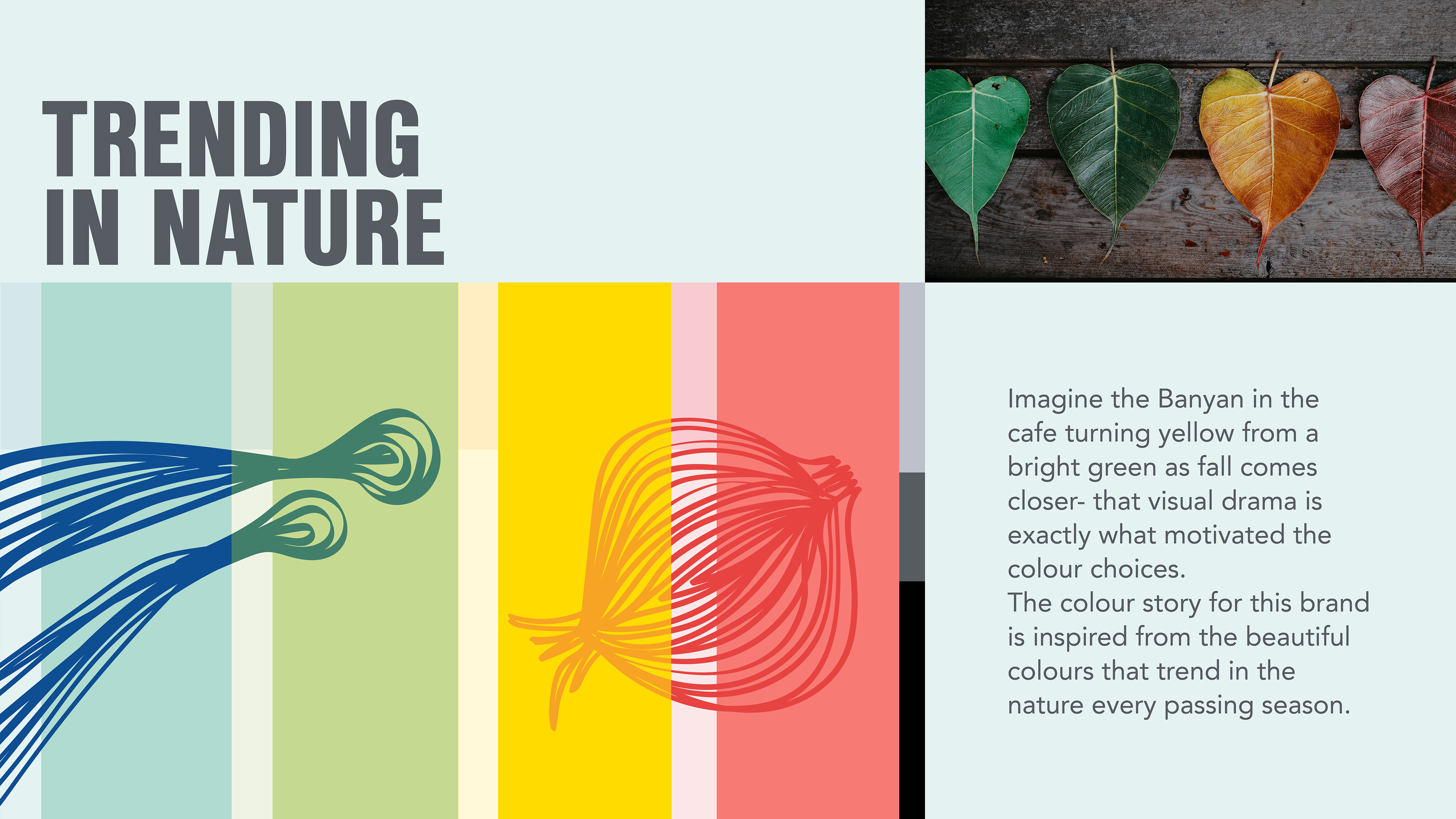
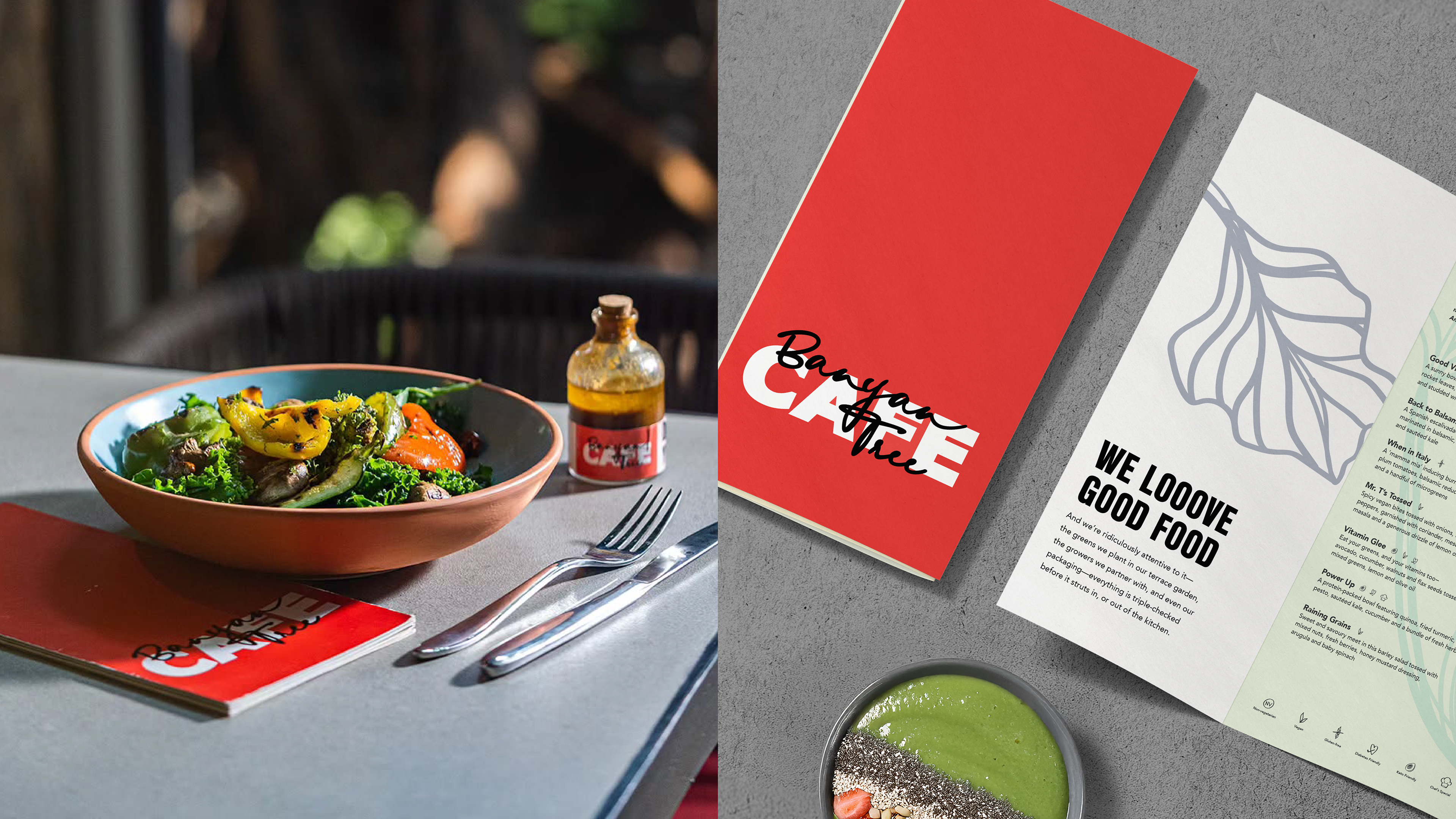
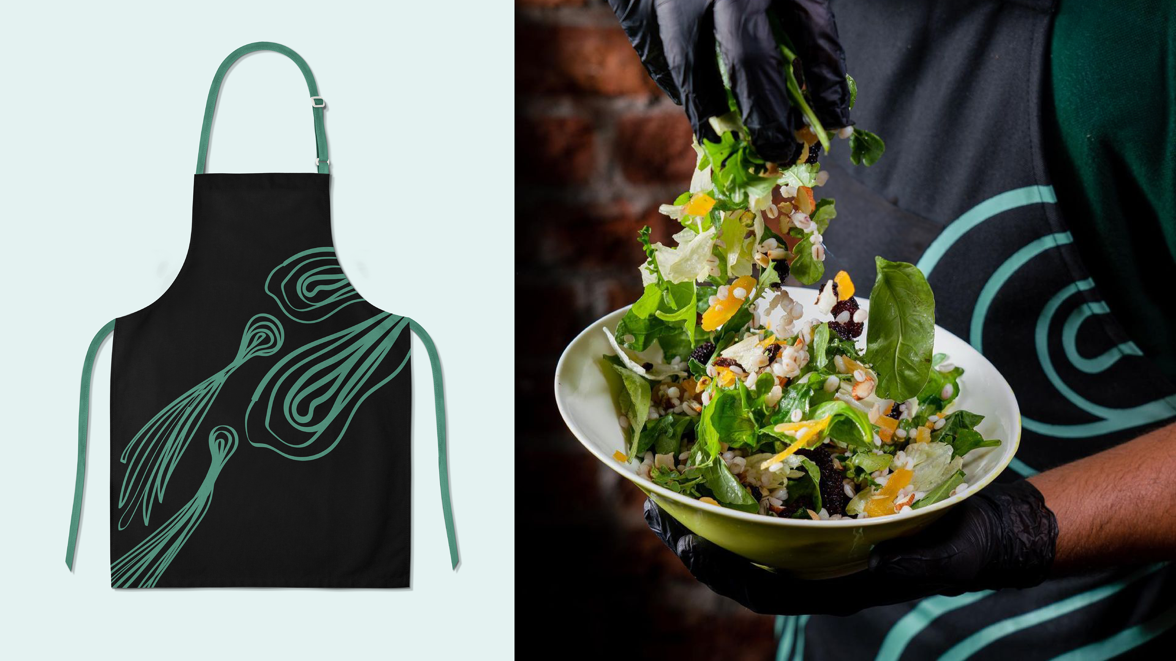
The colour story of the brand is inspired by the changing colors of the banyan tree in every season. The colours not only brought a vibrant and warm atmosphere to the Cafe, but also became elements of interest in an otherwise grey-brown space.
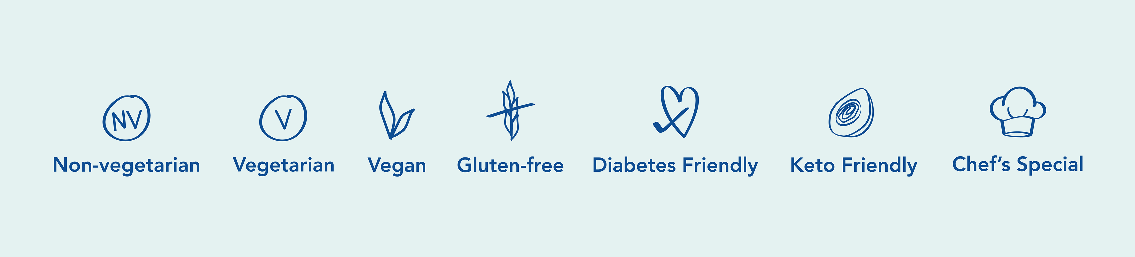
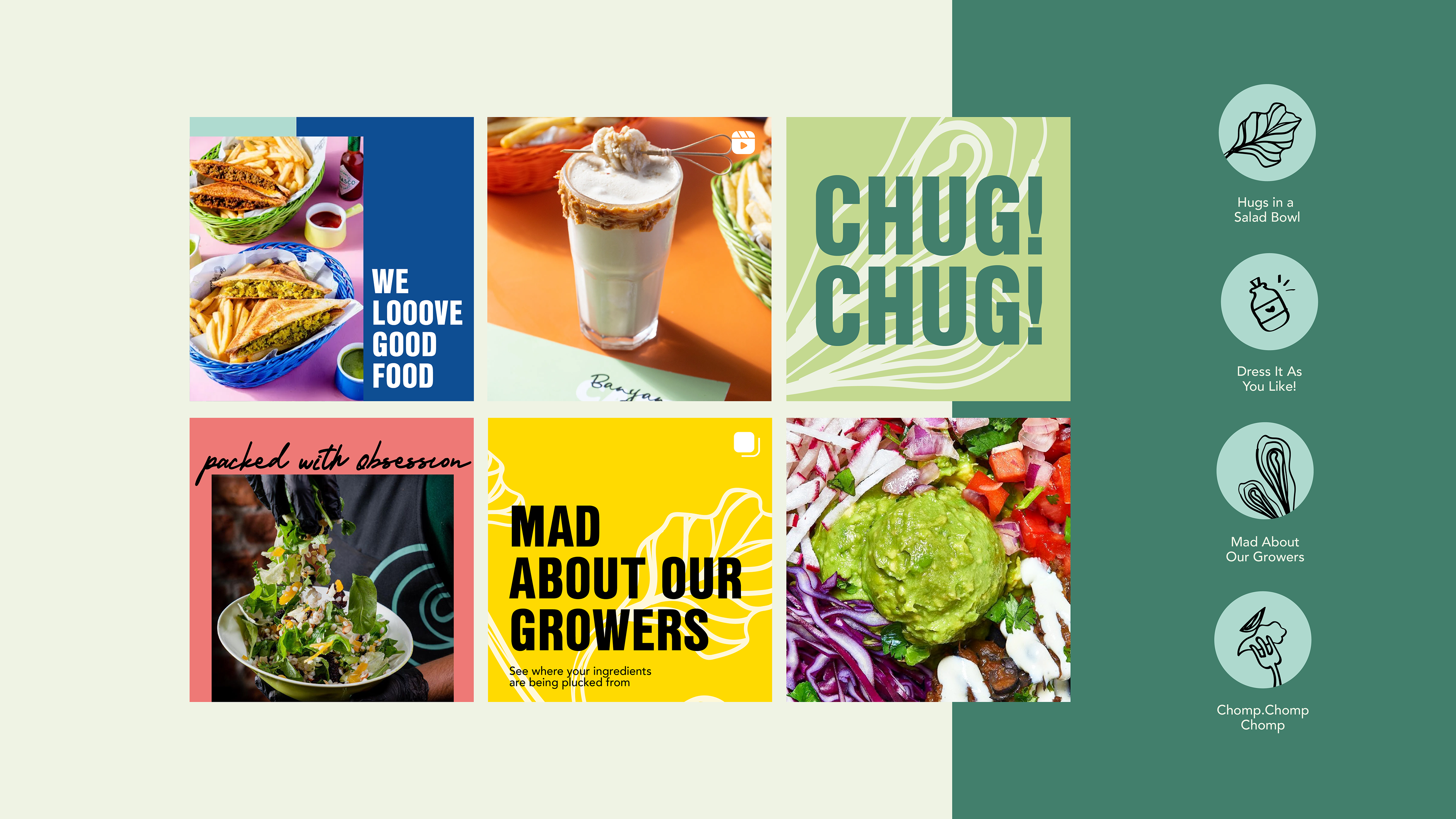
Custom iconography for the brand
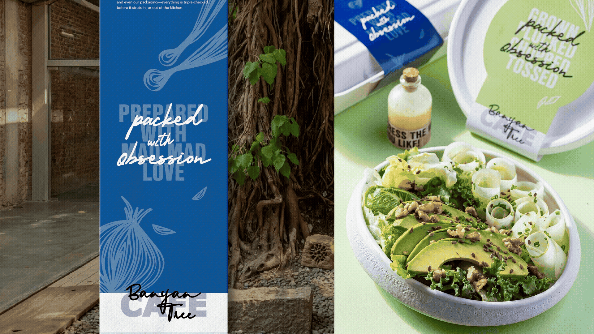
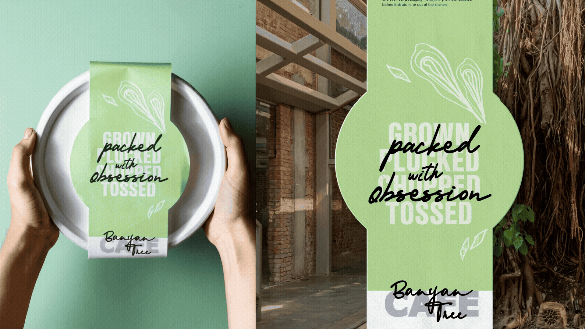
I designed the packaging sleeves for takeaway boxes to prominently display the café's philosophy at the front. Alongside this, the brand story and icons representing specific food details were included on either side. Additionally, each sleeve had a designated space for writing the names of the salads and bowls.
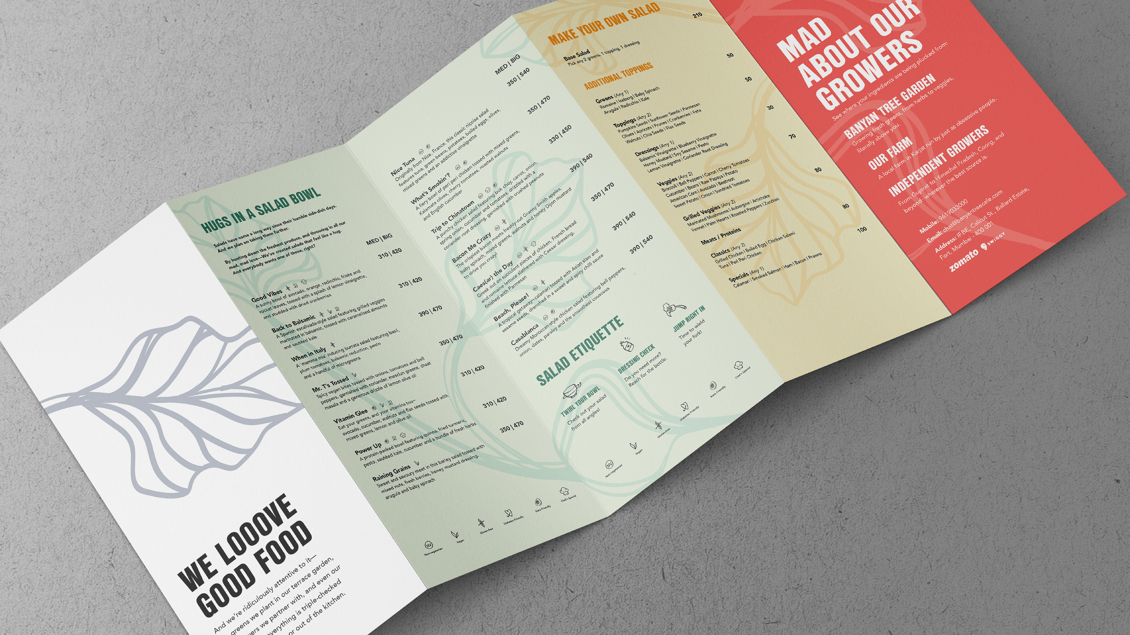
An accordion fold menu designed to include an extensive offering, along with sections on sourcing the ingredients and brand story.

From menus and sleeves to aprons and digital presence, the design system worked consistently across touchpoints. It earned press coverage in Elle, Condé Nast Traveller, and What’s Hot: "Mumbai's Banyan Tree Cafe Comes With A Side Of Art And Design."
The café also became part of countless Instagram reels, generating organic UGC that extended its reach. More importantly, it gave the café a warm presence that turned a stark industrial space into a place people wanted to gather and enjoy fresh food.
The café also became part of countless Instagram reels, generating organic UGC that extended its reach. More importantly, it gave the café a warm presence that turned a stark industrial space into a place people wanted to gather and enjoy fresh food.
Role: Creative Direction | Design | Illustration | Motion Graphics
Agency: Please See//
Team Lead: Imran
Copywriter: Subhannita
Brand Manager: Anshaya, Priti
Strategy: Richa
Team Lead: Imran
Copywriter: Subhannita
Brand Manager: Anshaya, Priti
Strategy: Richa