
Animated GIF showcasing the brand logo
Haldiram’s is known for its authentic Indian sweets and savoury snacks. For over 80 years, the brand has delighted customers in India and worldwide. Over time, Haldiram’s has become a trusted name, earning the loyalty of millions.
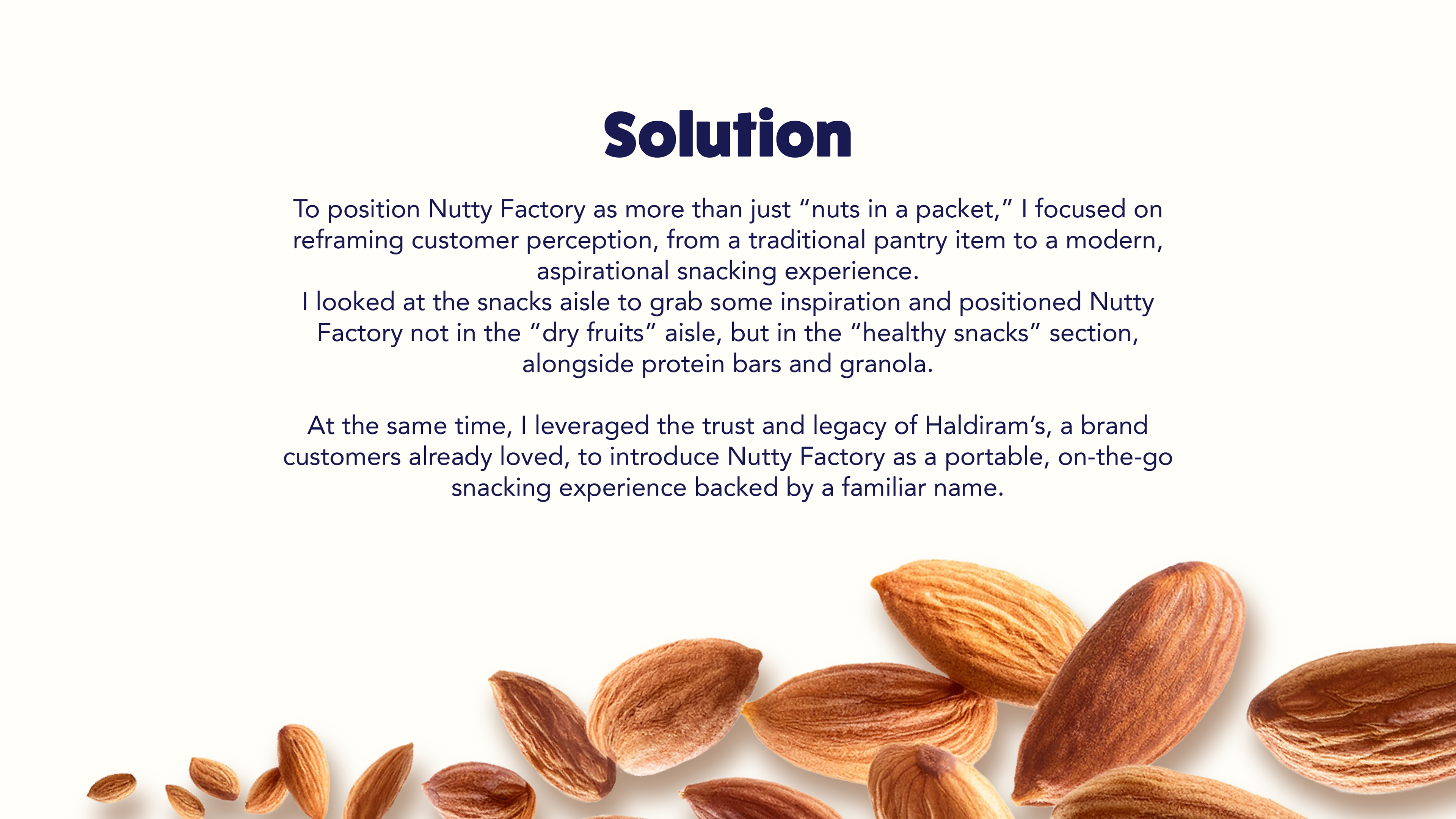
Haldiram's wanted to continue this legacy through Nutty Factory. Nutty Factory, a sub-brand of flavoured nuts designed for today’s health-conscious consumer. They are guilt-free, full of flavour, and convenient for modern lifestyles.
CHALLENGE:
For decades, Indian consumers have purchased nuts in bulk from local shops as a staple rather than a branded snack. At the same time, healthy snacking in India was only beginning to take off through trail mixes and protein bars.
The challenge for Haldiram’s was clear: how do you reintroduce nuts as a modern, on-the-go snacking experience while building on Haldiram’s legacy of trust?
Brand colour palette
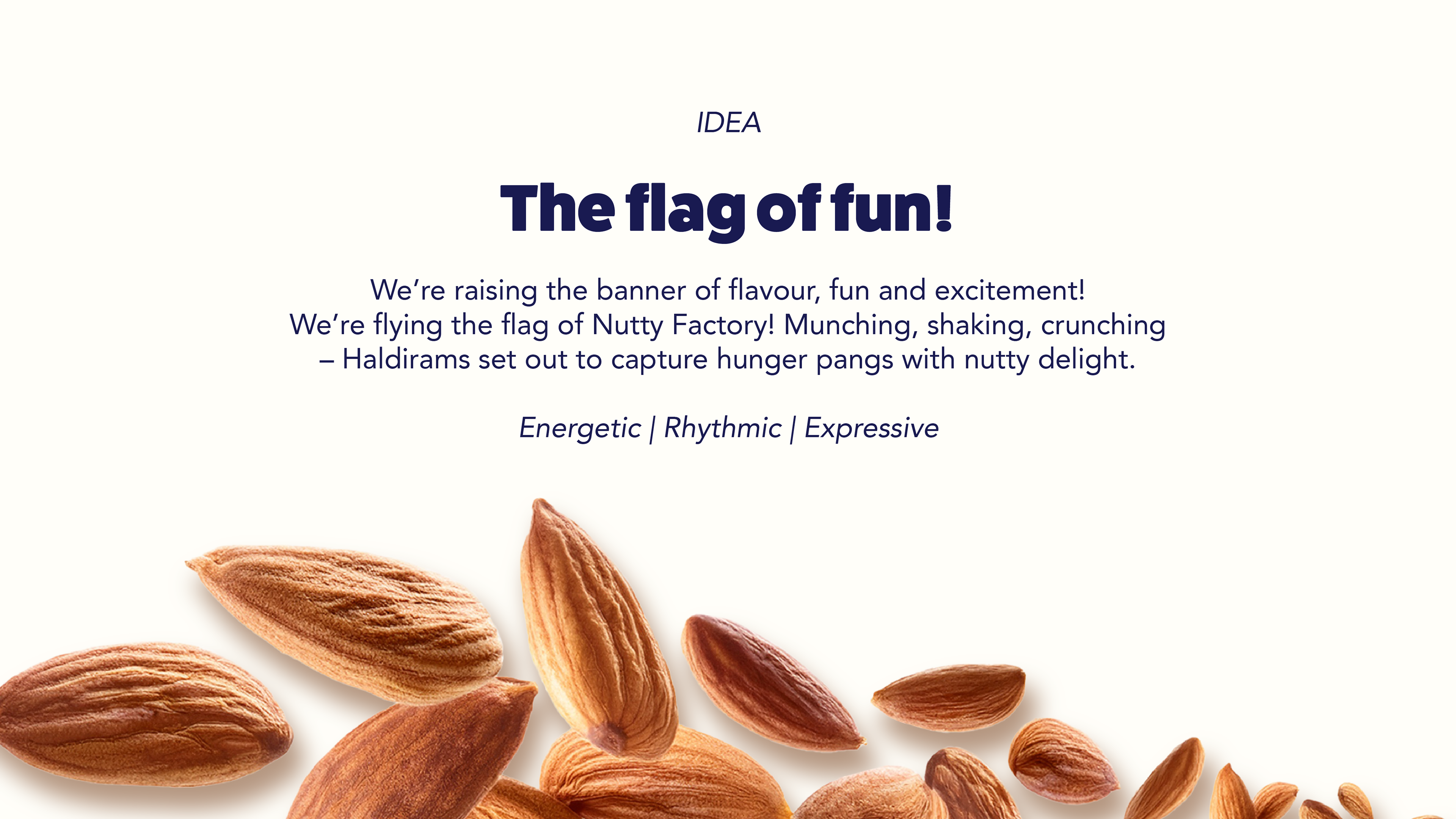
Drawing inspiration from Haldiram’s rich legacy, I developed the concept of “raising a flag of fun and flavours.” This idea became the foundation of the entire visual identity, right from the logo to the packaging system. The result was a snacking experience that felt modern, fun, and exciting.
The logo features a banner with a typographic mark that exudes energy and expression. The flourishes are borrowed from the parent brand. This reinforces continuity with Haldiram’s while still being approachable and playful, unlike traditional Indian dry fruit brands.
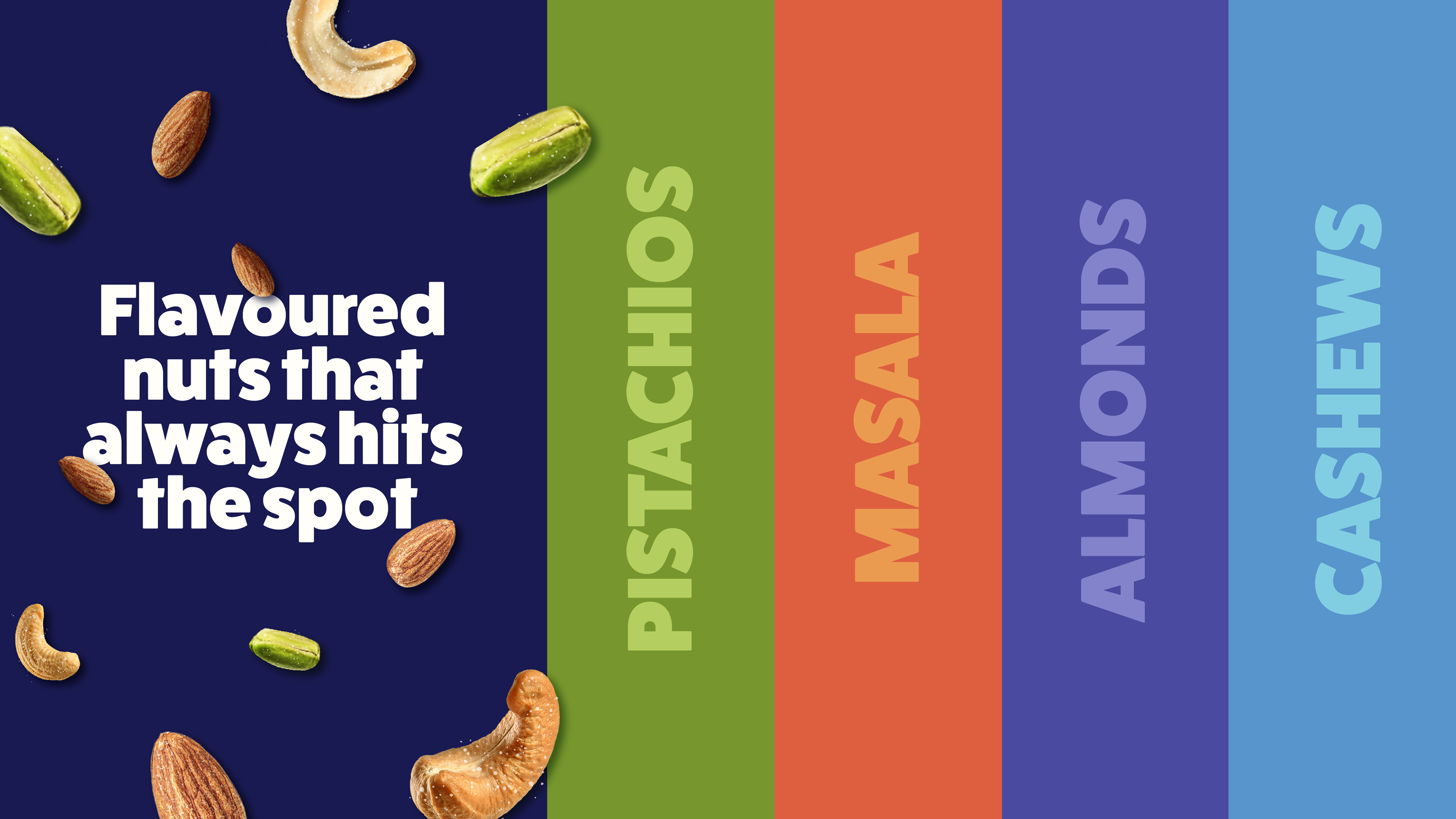
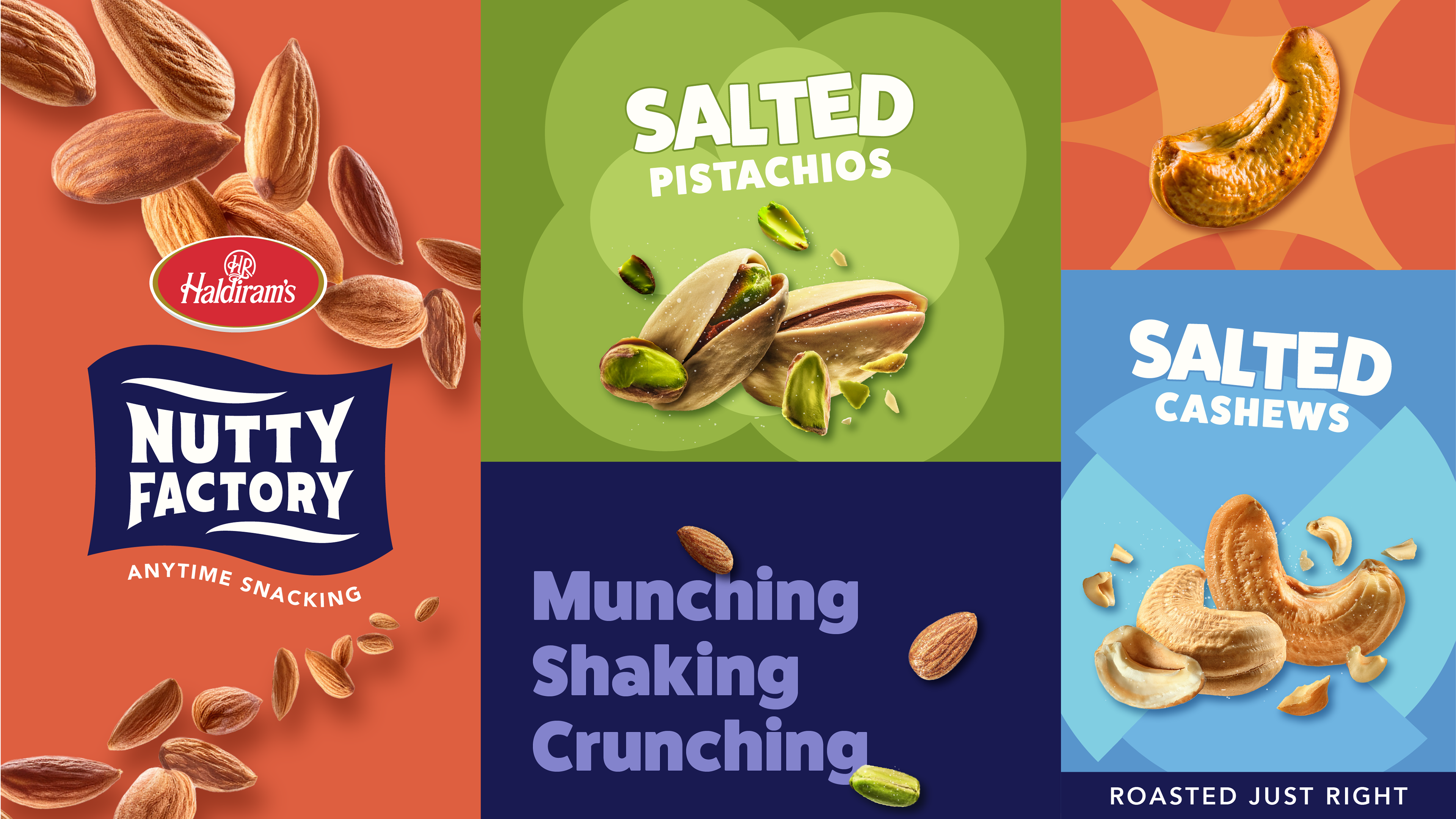
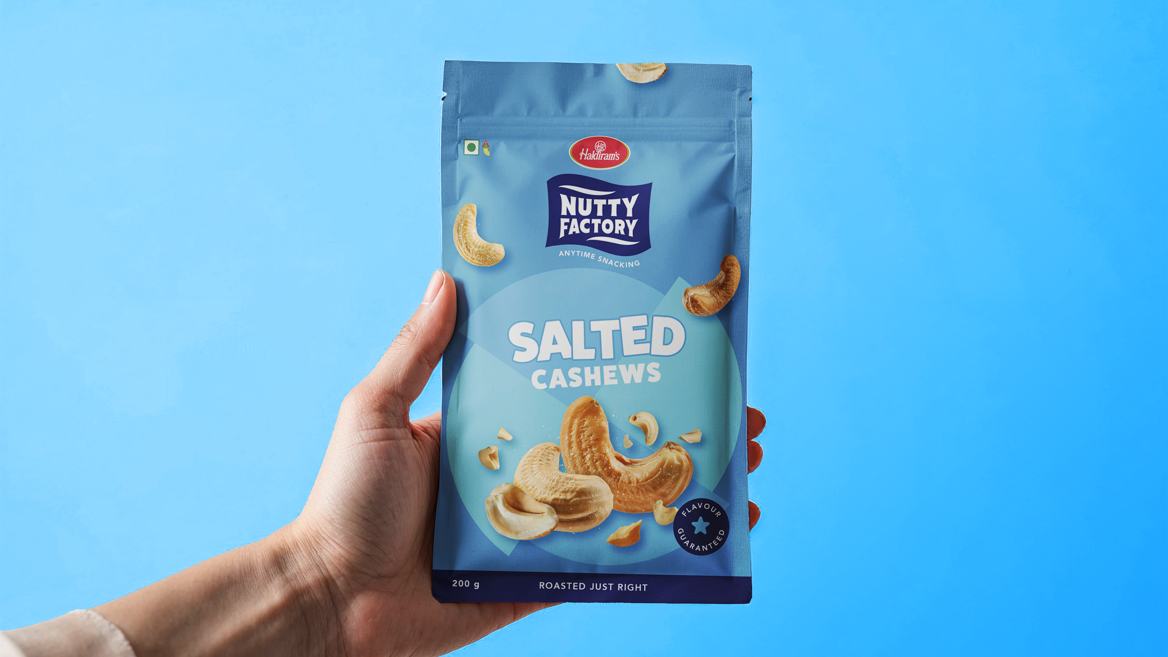
The design system was designed with snacking cues in mind to make maximum impact on the shelf. The colour palette is vibrant, exciting, and flavour-coded to differentiate variants and invite impulse purchase.
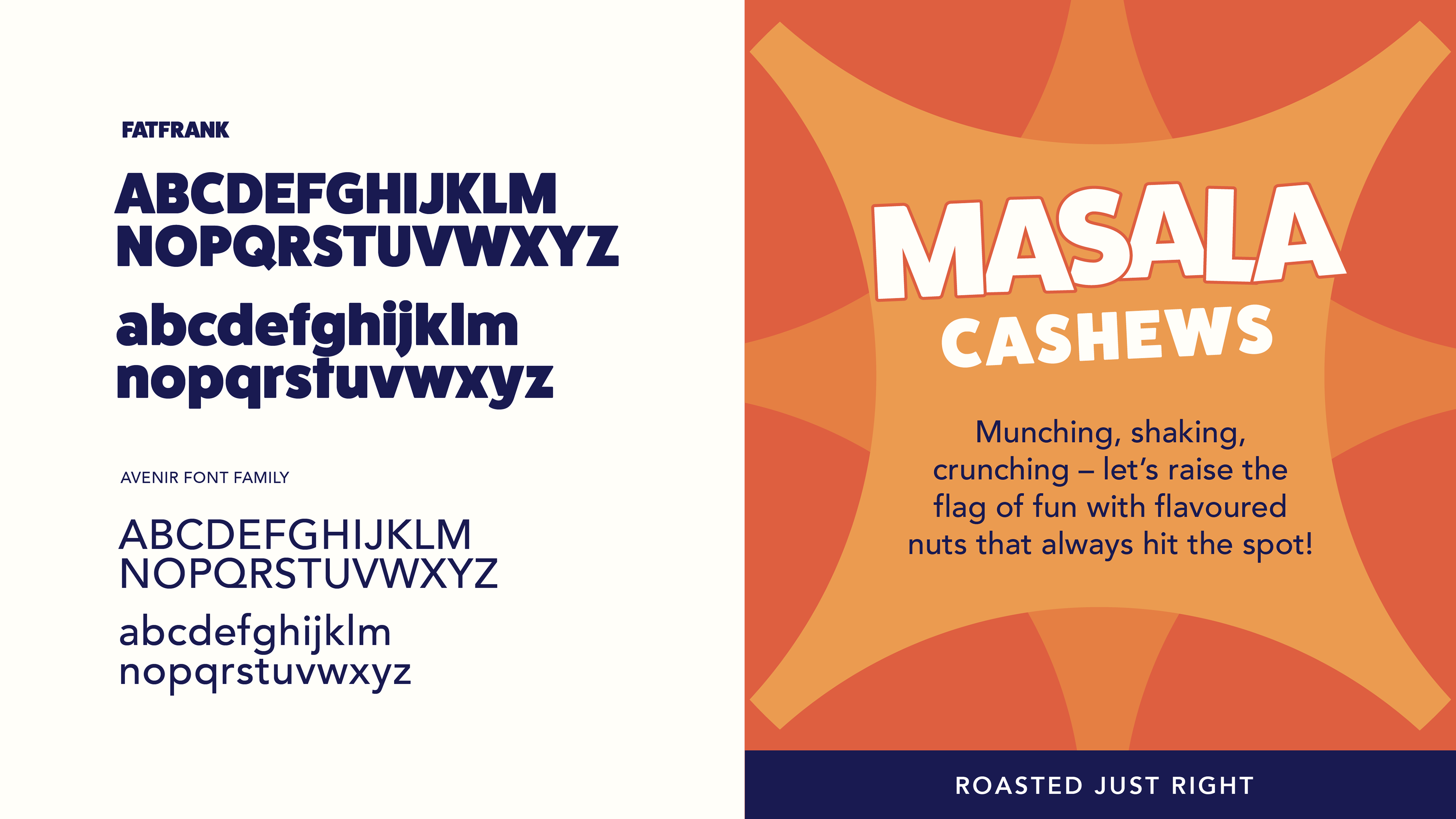
I chose a bold, rounded typeface and created a rhythmic typographic treatment that adds a layer of energy and fun associated with snacks.
I chose a bold, rounded typeface and created a rhythmic typographic treatment that adds a layer of energy and fun associated with snacks.

Animated GIF showcasing various graphic elements designed for Nutty Factory
Inspired by flags and symbols of celebration, I created graphic elements that serve as the brand’s storytelling devices, consistently reinforcing the idea of joy and flavour. That, combined with the key visual of the nuts, mimics the idea of a flavour explosion of nuts.
Brand moodboard for Nutty Factory, including all the elements that build a holistic design system
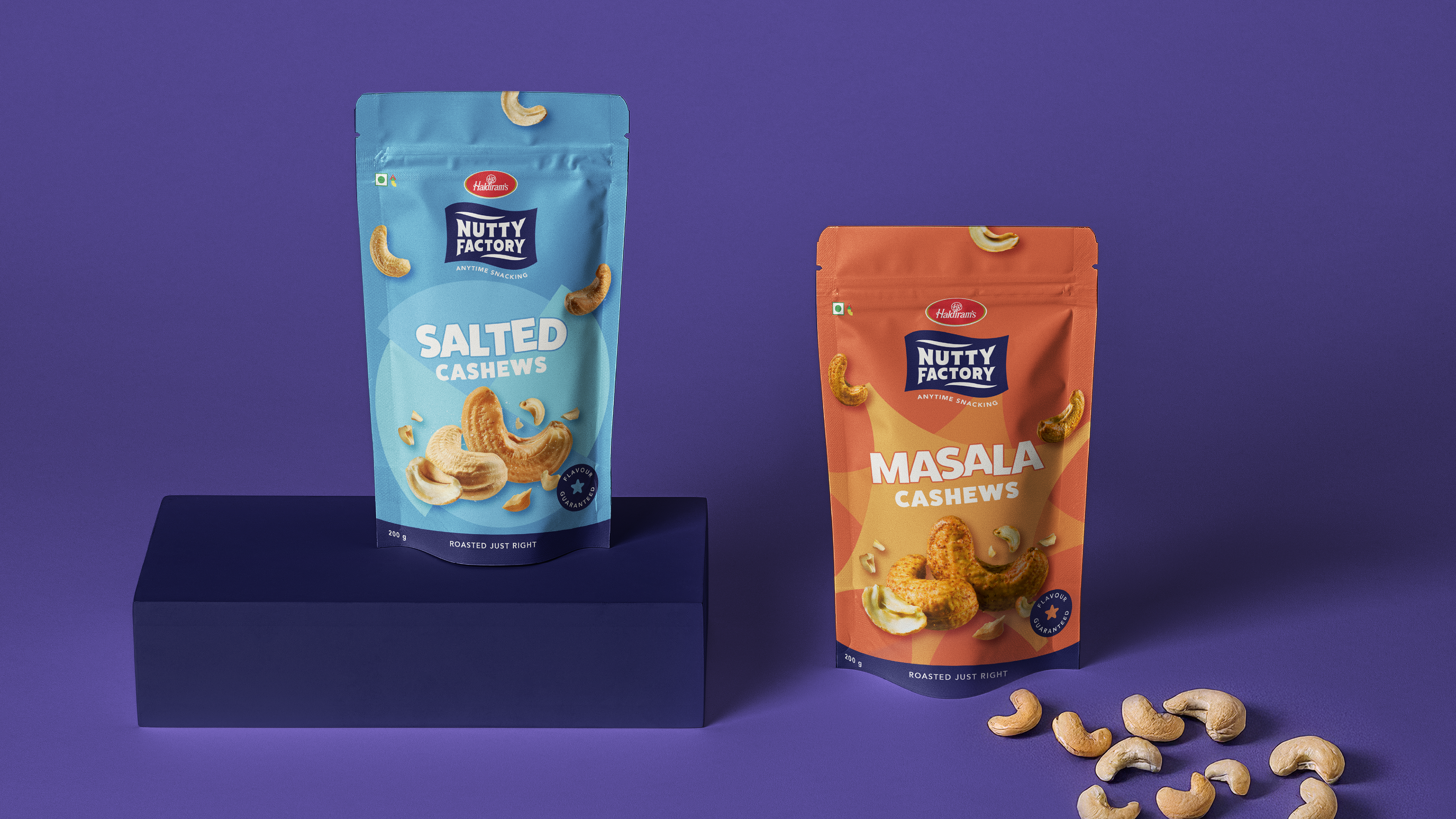
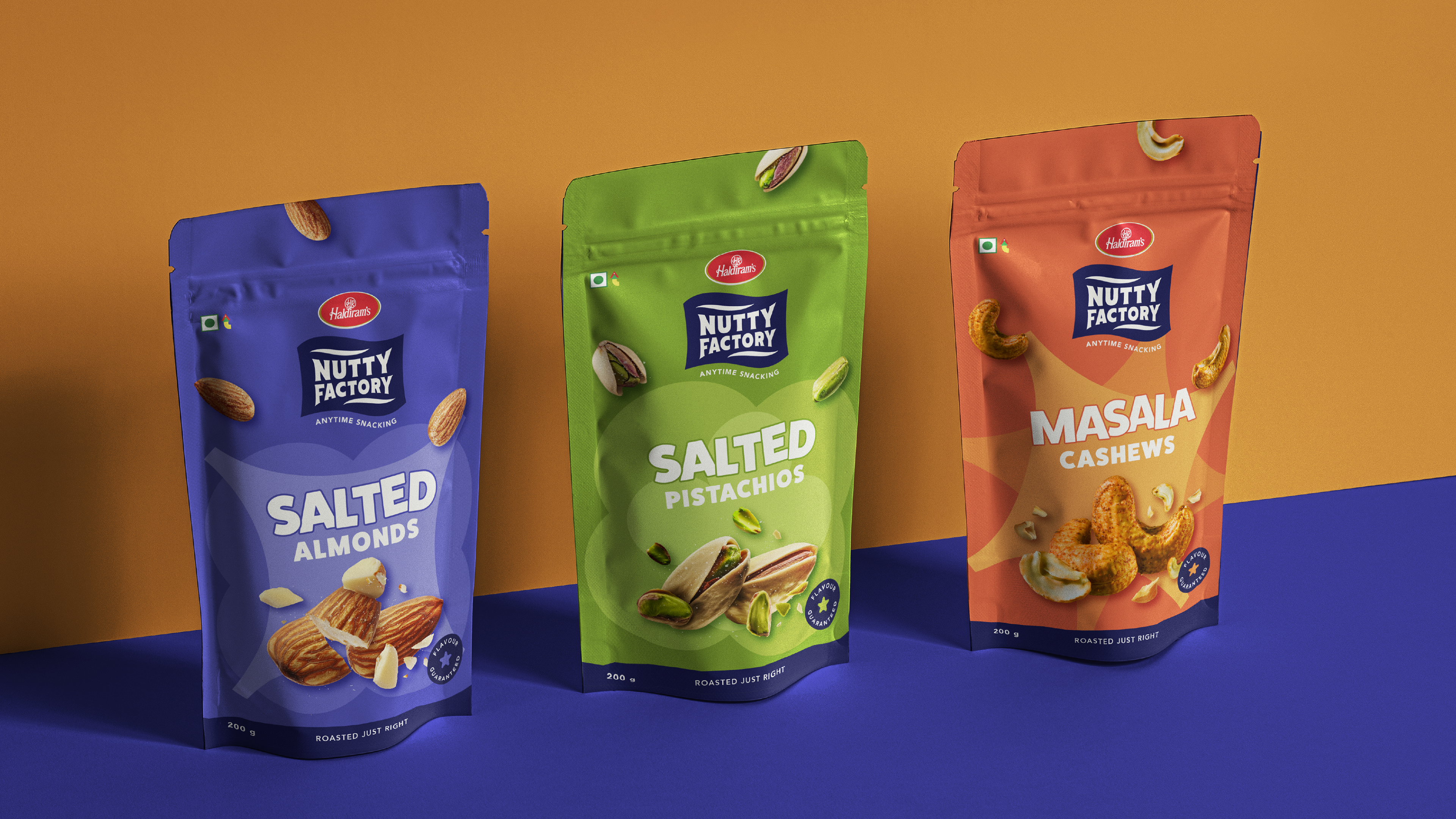
Packaging design variants
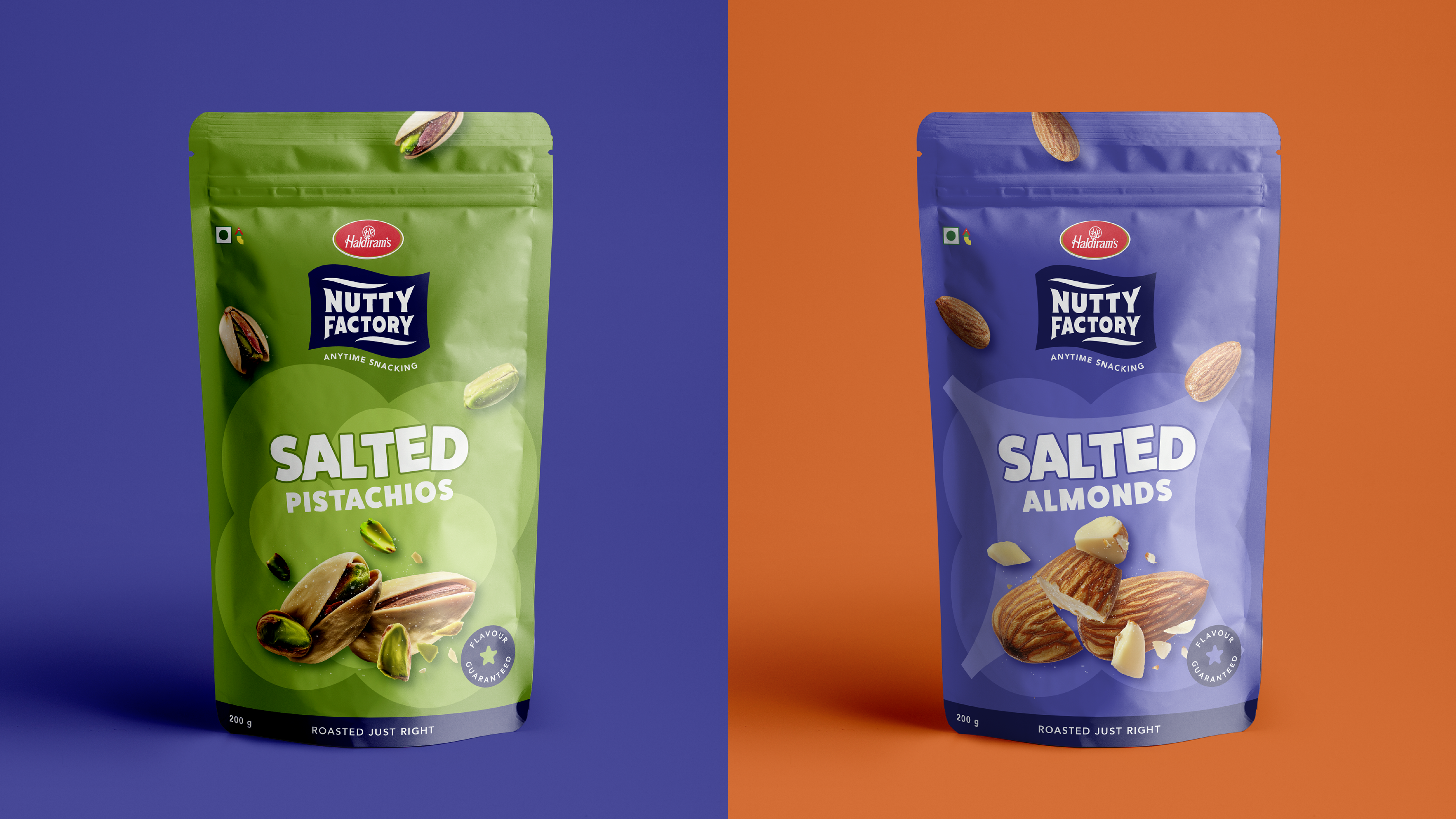
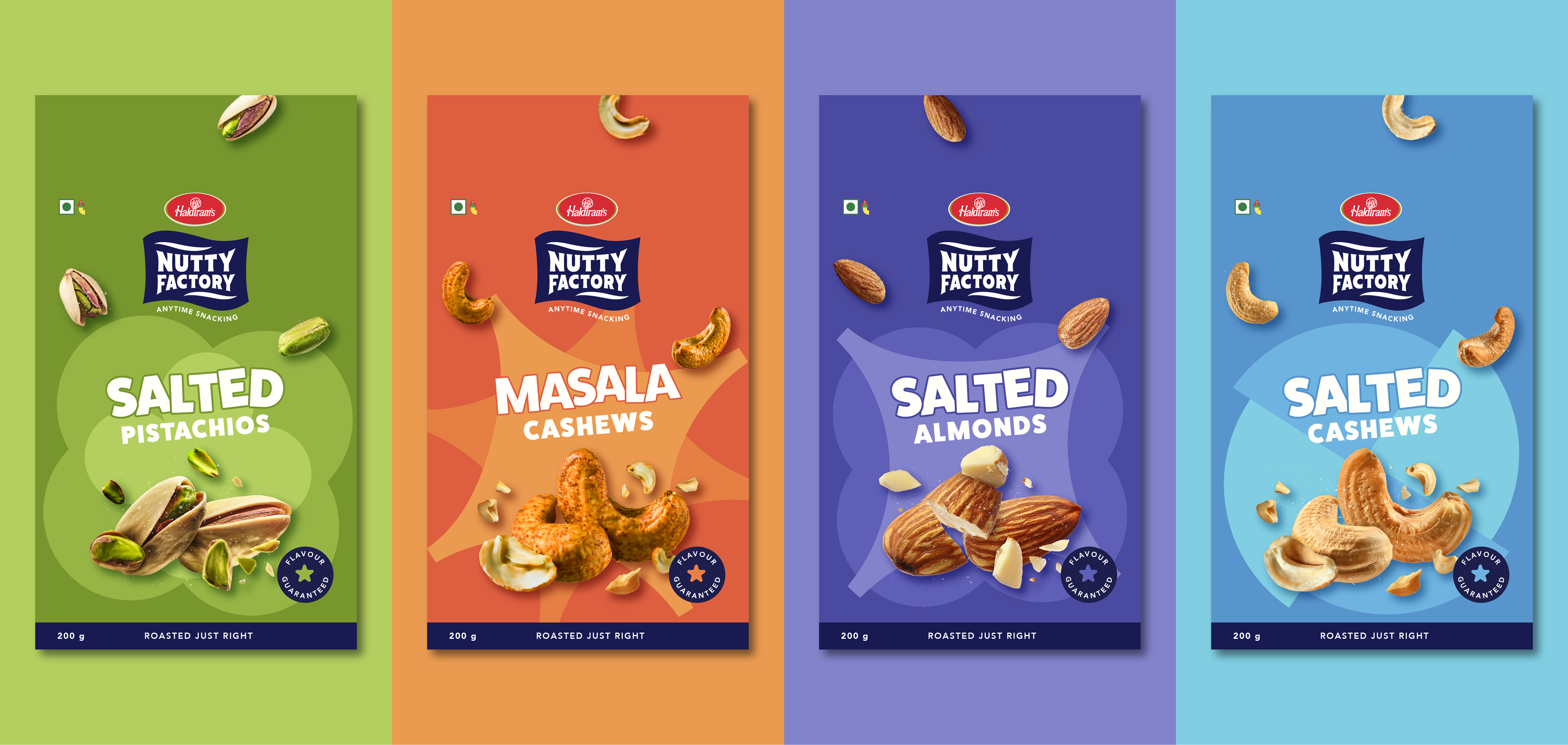
With single-serve and resealable formats, the packaging communicates both flavour-forward indulgence and everyday convenience, positioning Nutty Factory as a snack designed for modern lifestyles.
The identity bridges legacy trust with a modern, youthful energy and reframes nuts from a commodity to an exciting lifestyle snack.
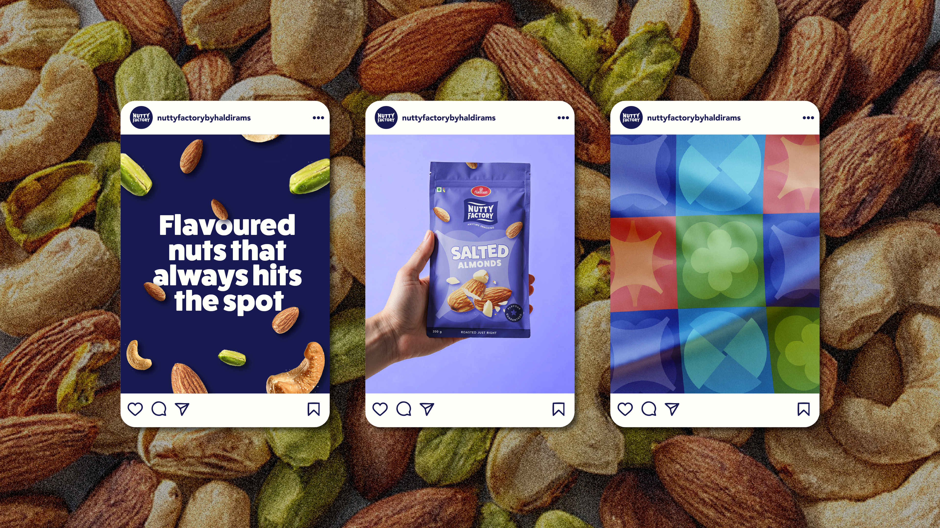
Social media posts for the brand
Role: Creative Direction | Design | Image creation
Agency: Please See//
Team Lead: Kassandra
Brand Manager: Melroy
Team Lead: Kassandra
Brand Manager: Melroy